Before we continue with our project, we should know a bit about Flex.
Flex stands for Flexible Box Layout. In flex we arrange elements relative to each other either horizontally or vertically. The best example of flex is youtube.
Though we can arrange them without using flex as well, but flex helps to arrange these elements smoothly in a better way and with lesser code.
Flex Direction
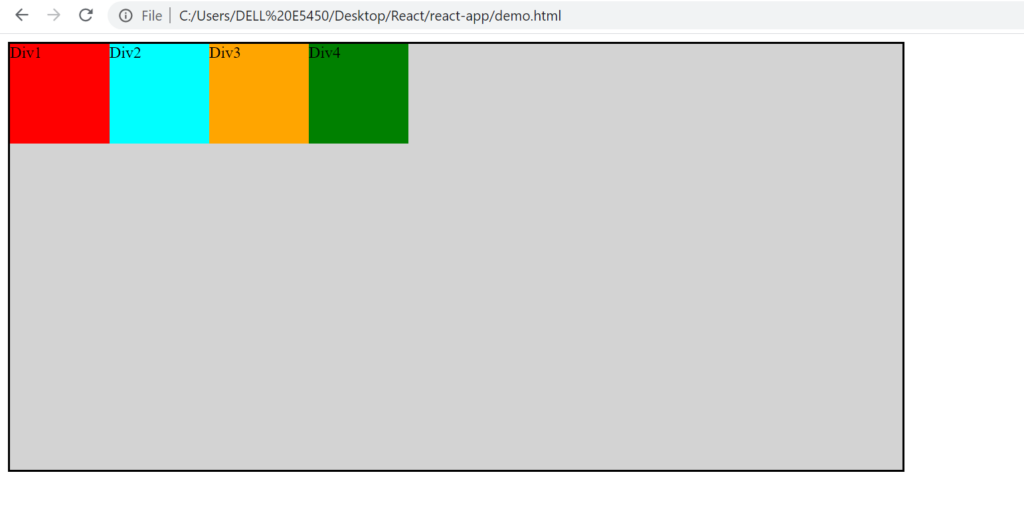
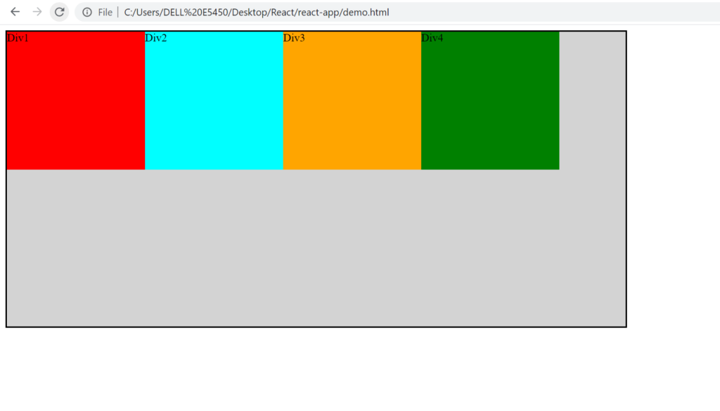
The default direction of flex is Horizontal(row).
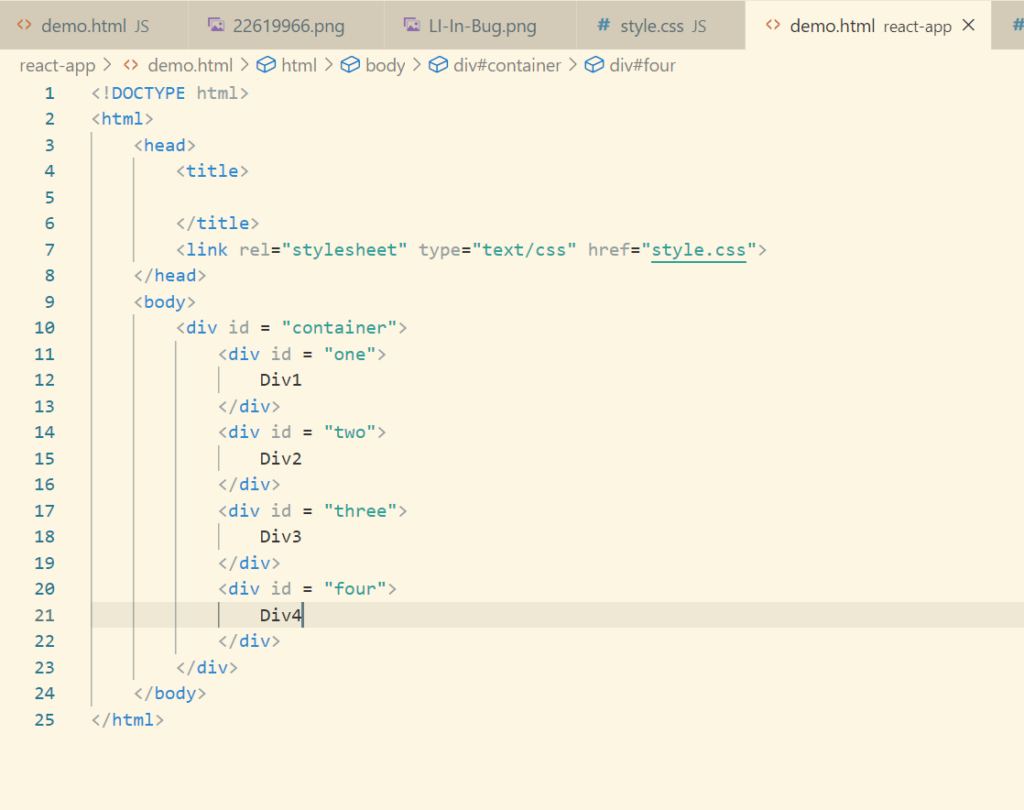
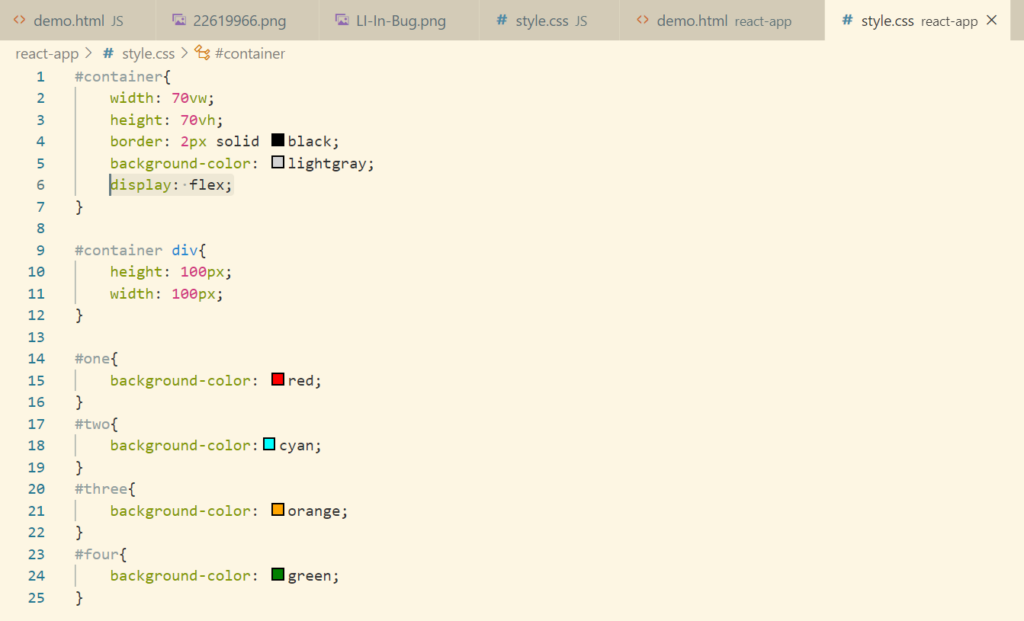
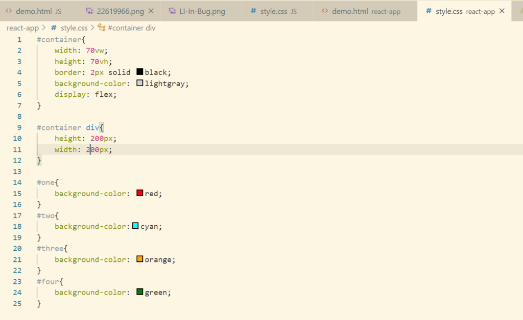
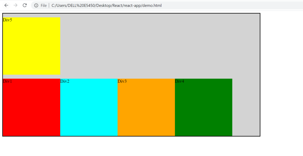
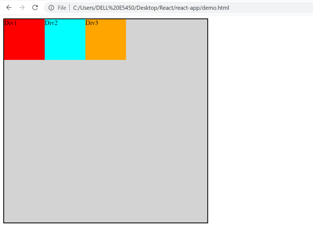
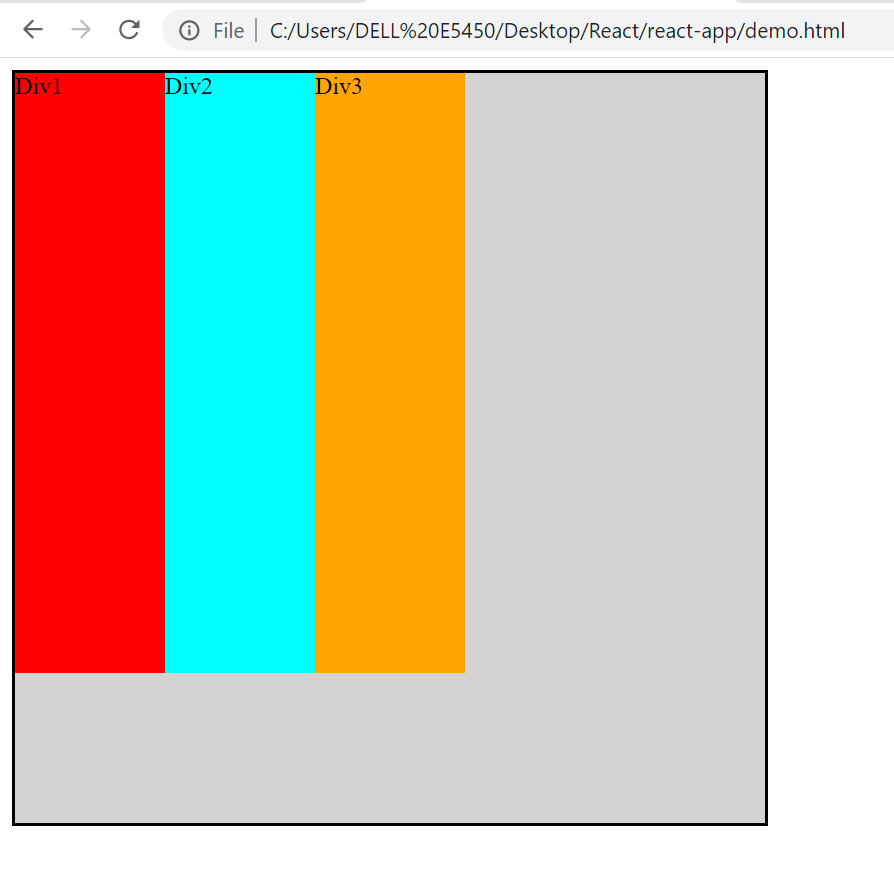
So as to understand this let’s create a bigger div and 4 smaller div inside that parent div and give them some colors.
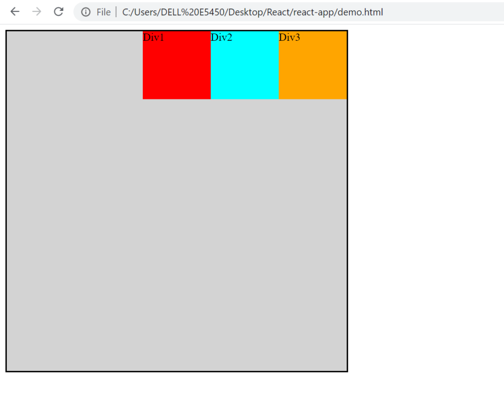
In order to change flex direction, we can change that using property flex-direction: column.
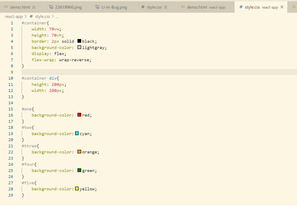
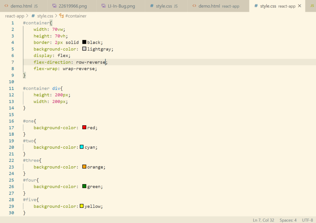
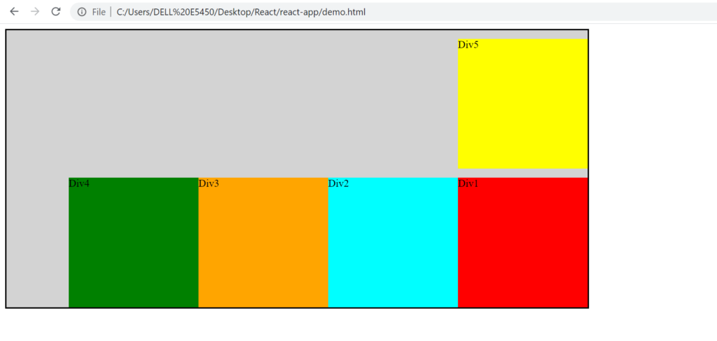
If we want to place the child div from right to left, then we can use the property value as row-reverse.
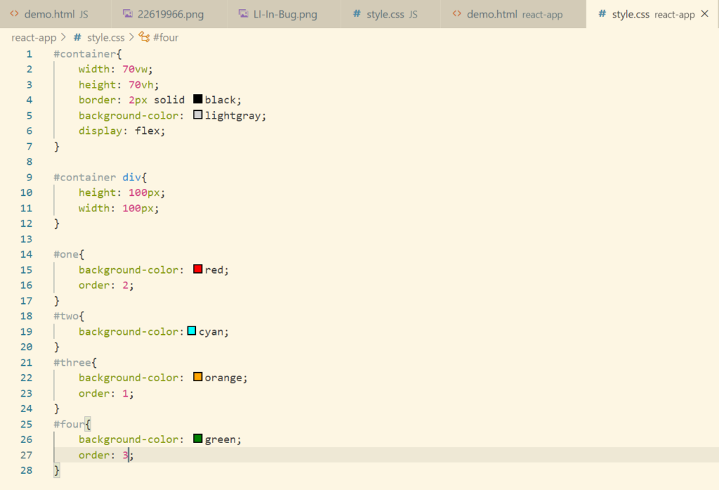
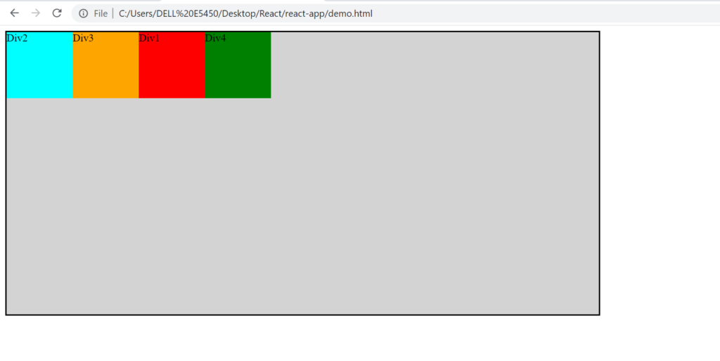
Question: What if we want to place the div’s in below order Div2, Div3, Div1, Div4, means in the order we want ?
For that we can set the property order to the child div explicitly. By default the order value is 0.
Flex Wrap
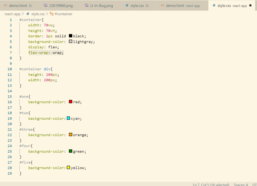
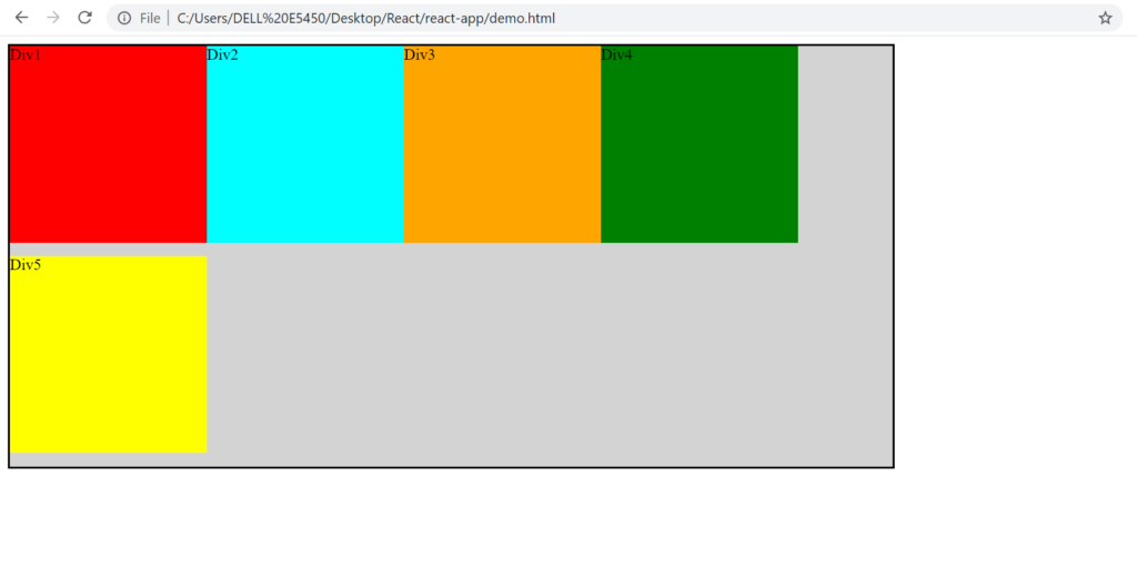
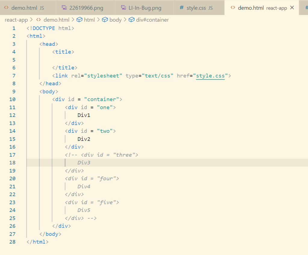
Let’s try to add one more div and see what happens
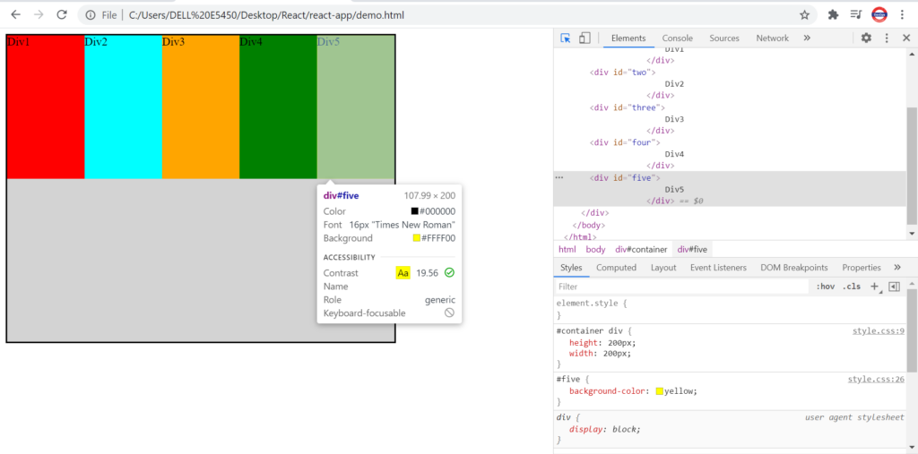
Though the height and width was set to 200px, 200px. On adding a new div, the width has reduced and div’s have adjusted themselves.
If we want the div’s should be displayed as per the height defined, then we need to use flex-wrap property.
Default value of flex-wrap property is no-wrap.
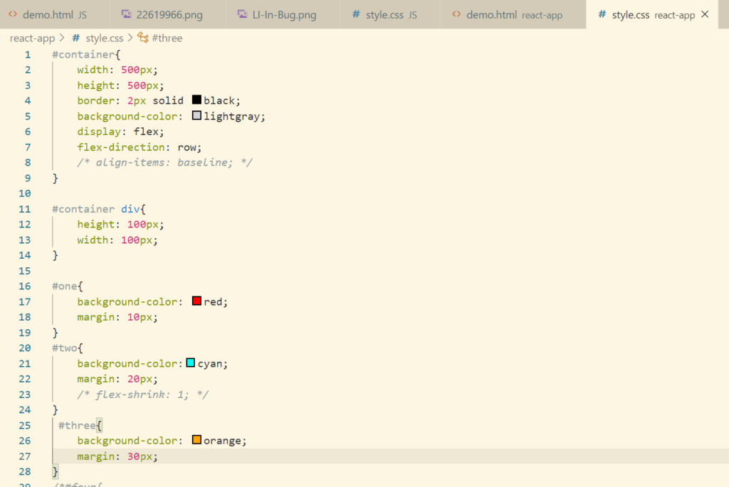
Flex Grow And Flex Shrink
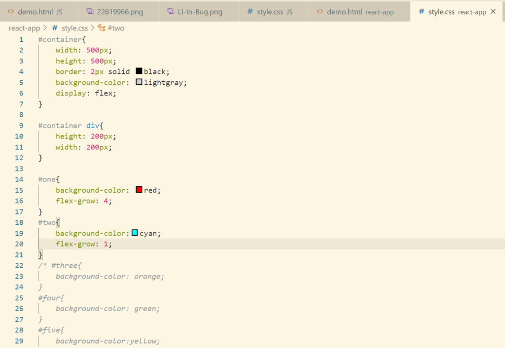
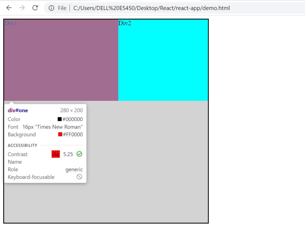
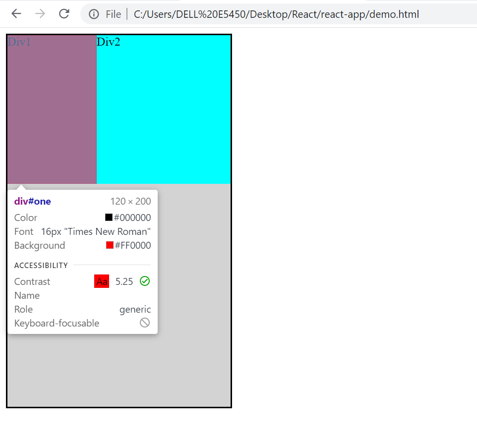
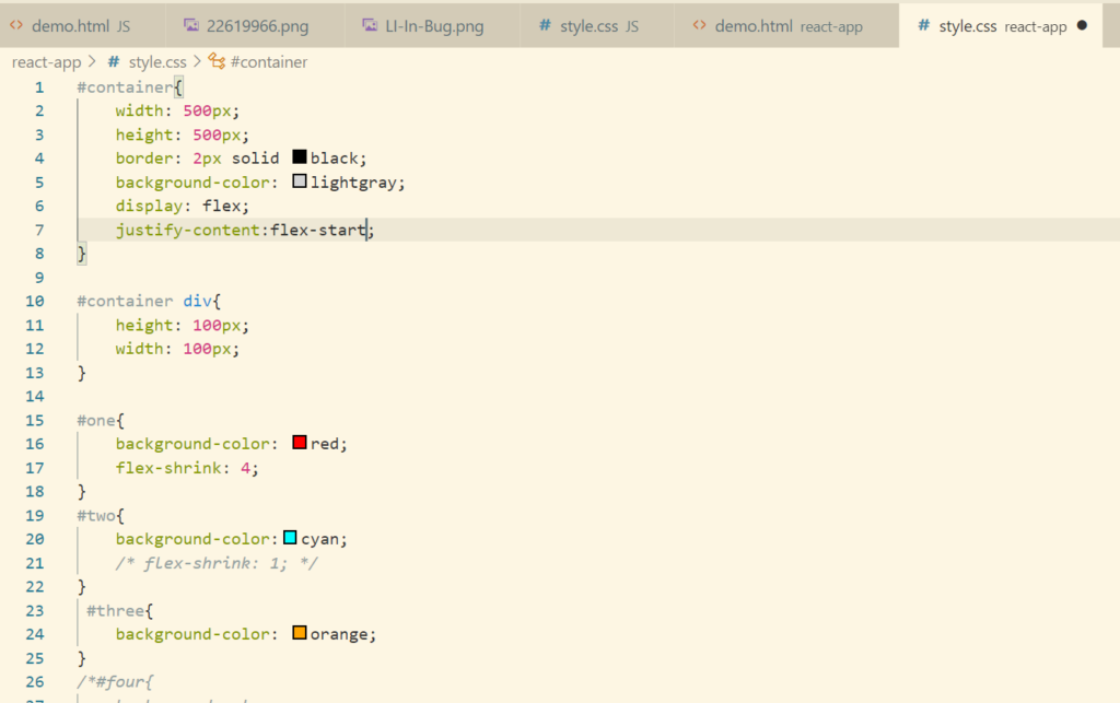
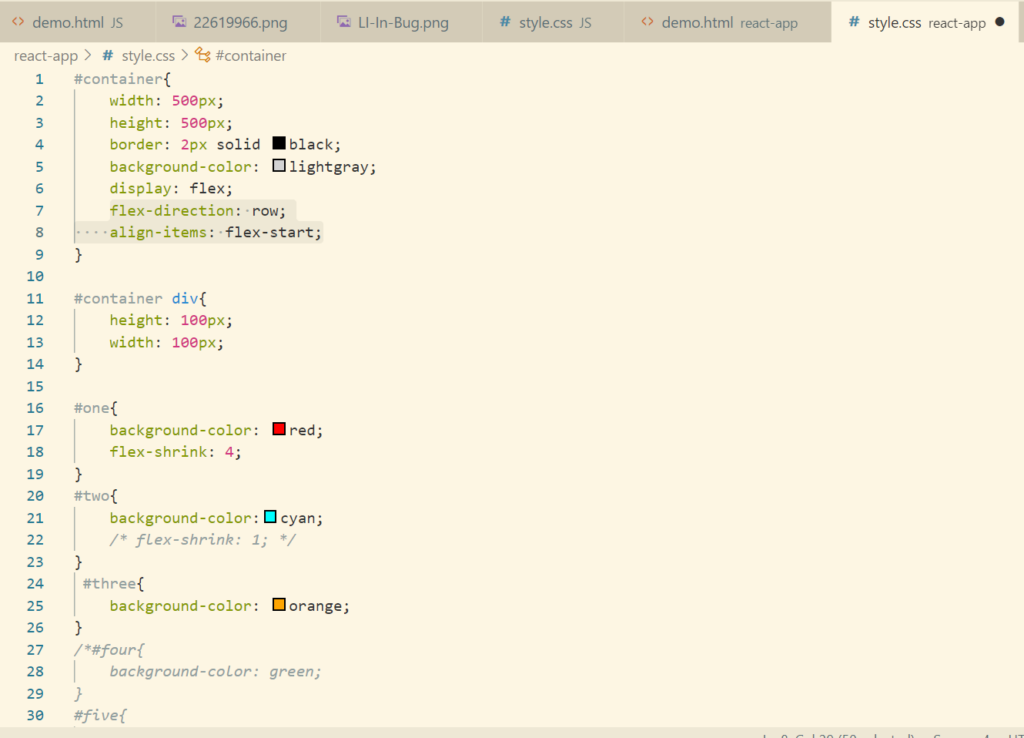
Let’s make some change in the html and css code. Just keeping 2 div and reducing the value of the parent div so as to understand this concept.
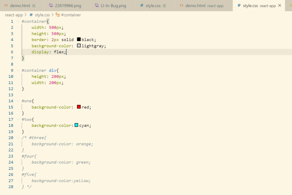
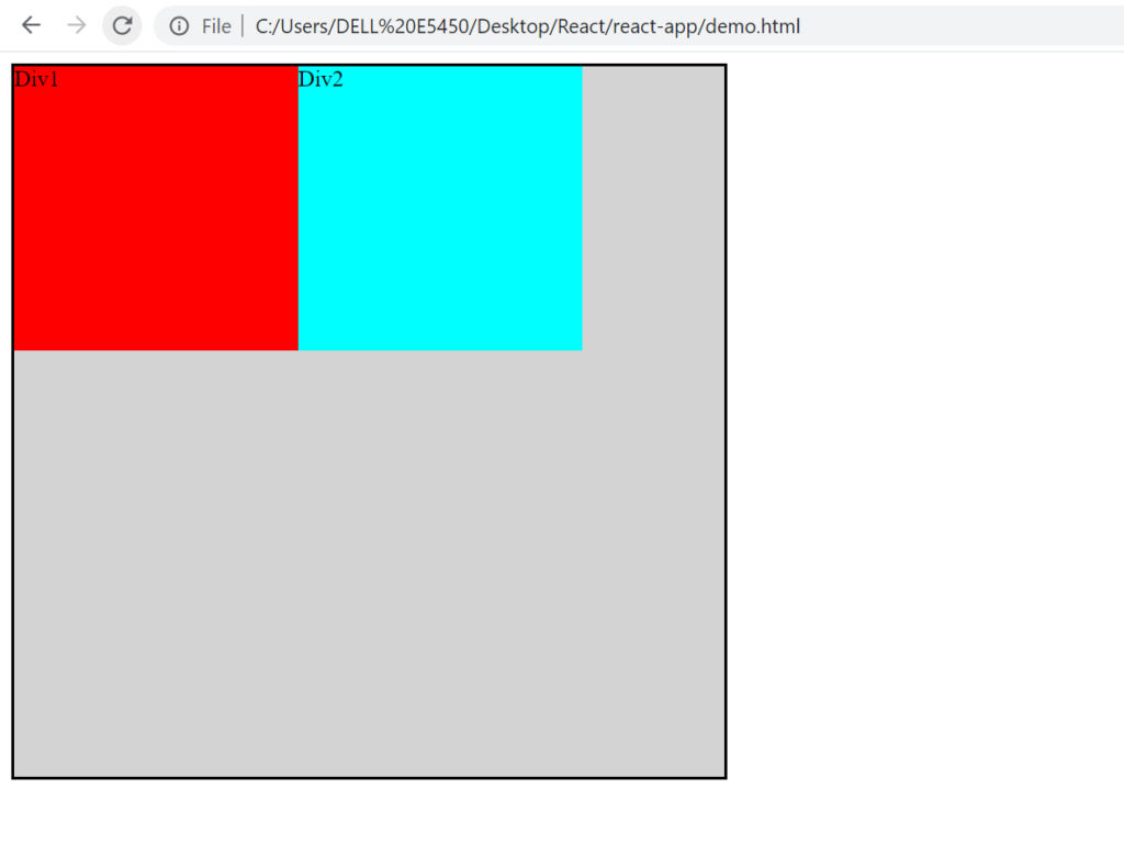
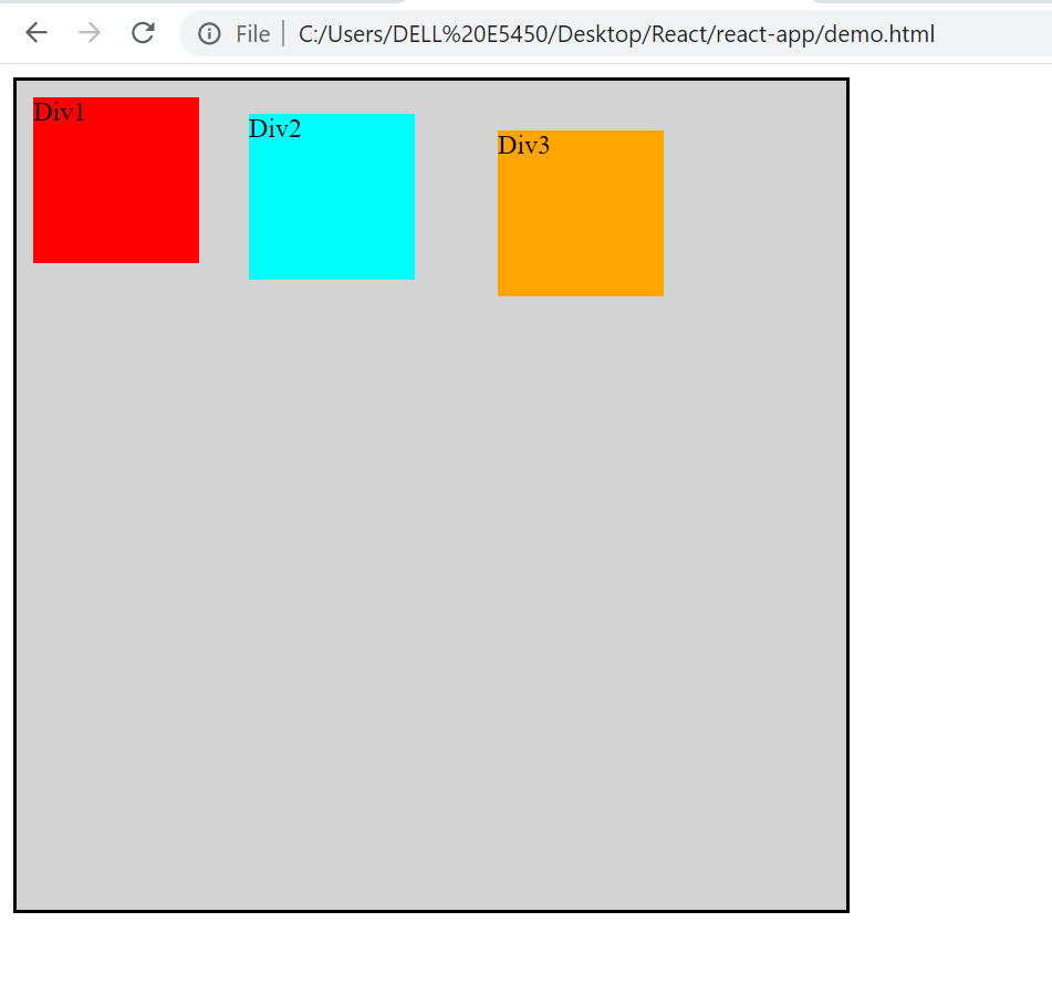
As the child div as 200px,200px and the parent div is 500px. There is a remaining of 100px available.
If we want that the child div should adjust accordingly to occupy the whole parent div, then we can use the property flex-grow.
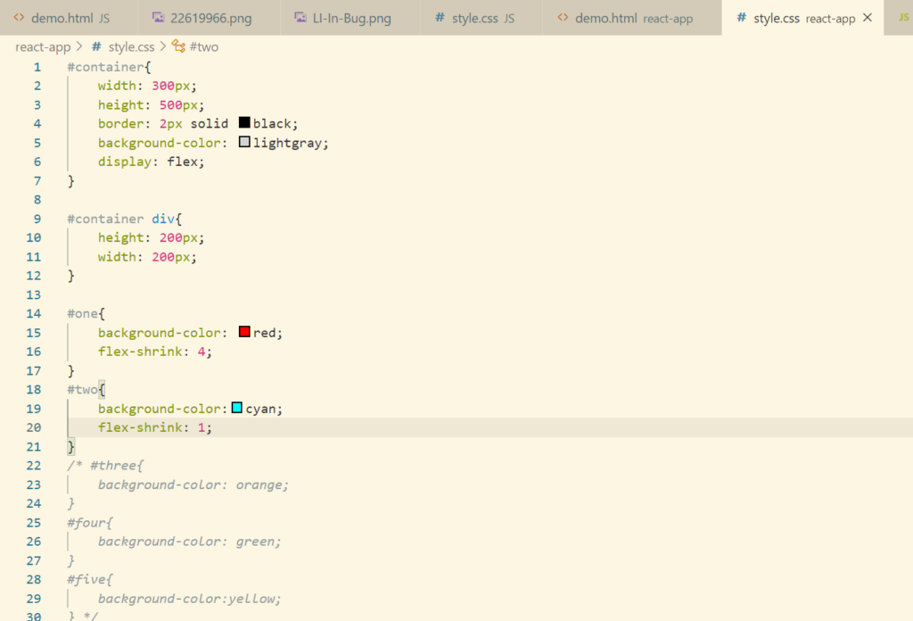
Now so as to understand the concept of flex-shrink, let’s reduce the width to 300px from parent div
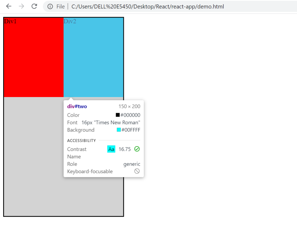
By default the div’s will distribute equally. Let’s implement flex-shrink property where we will deduct 80% from the div1.
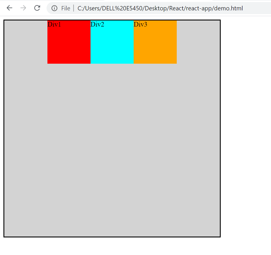
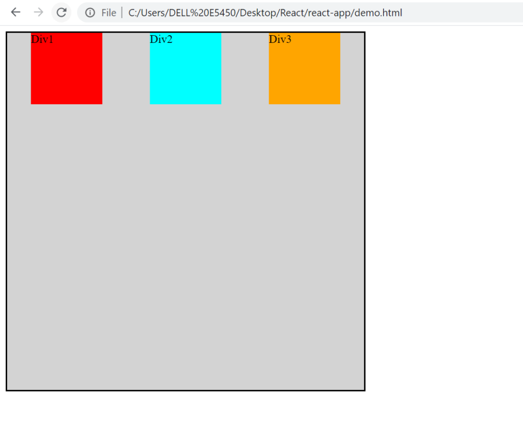
Flex Justify Content
Let’s just directly jump into the practical
Align Content
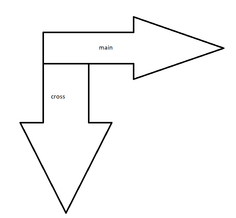
It is used to align the elements across the cross axis. For example
Let’s understand this with help of an example.
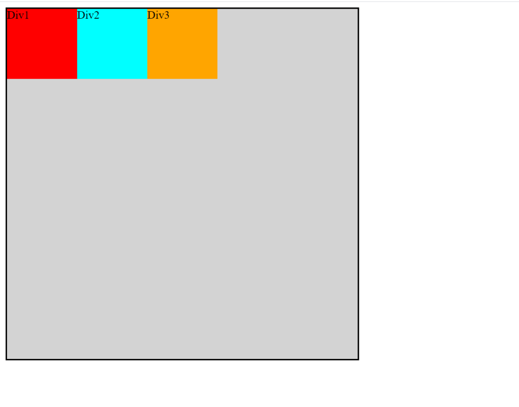
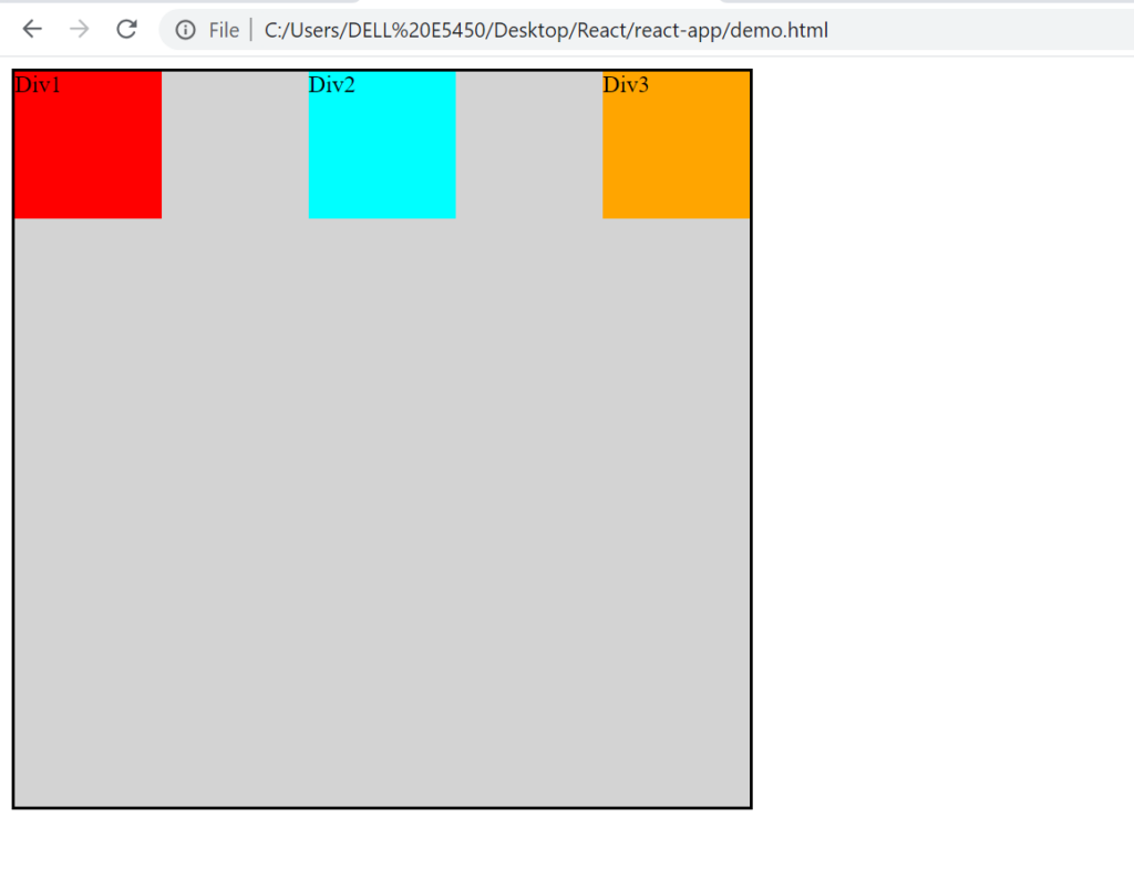
align-items: flex-start;
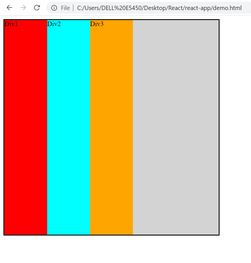
align-items: flex-end;
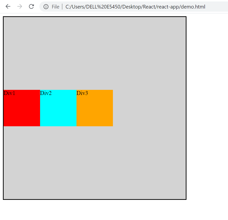
align-items: center;
flex-direction: row;
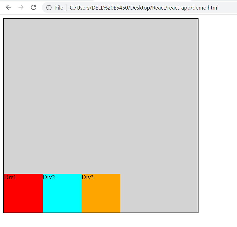
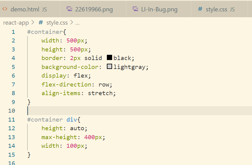
align-items: stretch;
#container div{
height: auto;
width: 100px;}
We can set max/min height as well.
Let’s see the last one which is baseline. Let’s include margin so as to understand this.
Project
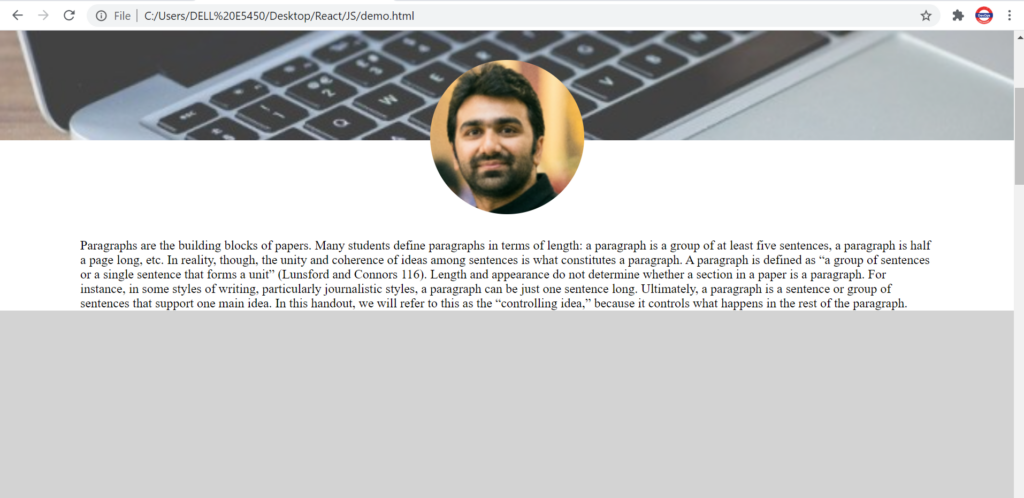
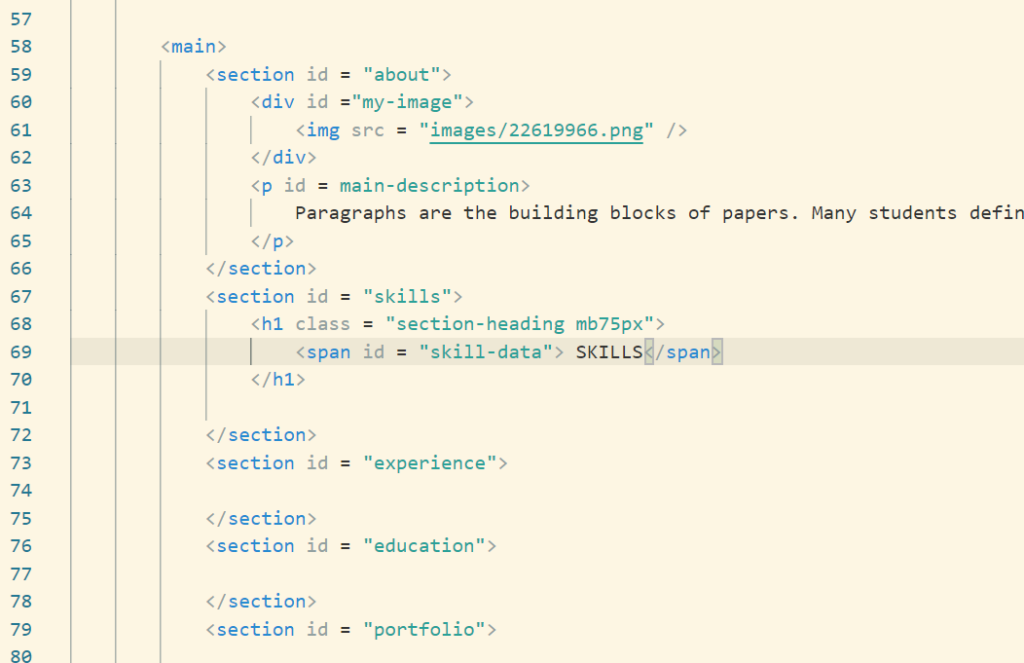
Converting Resume Code to Flex
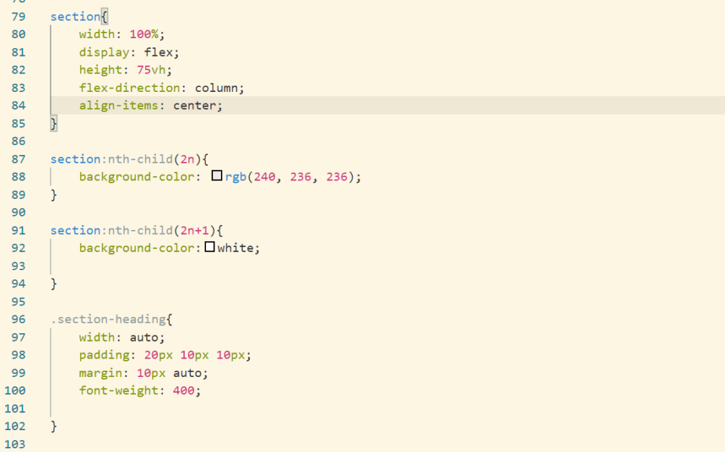
Skills, education, portfolio, contact section would be in a form of flex. Let’s make that change.
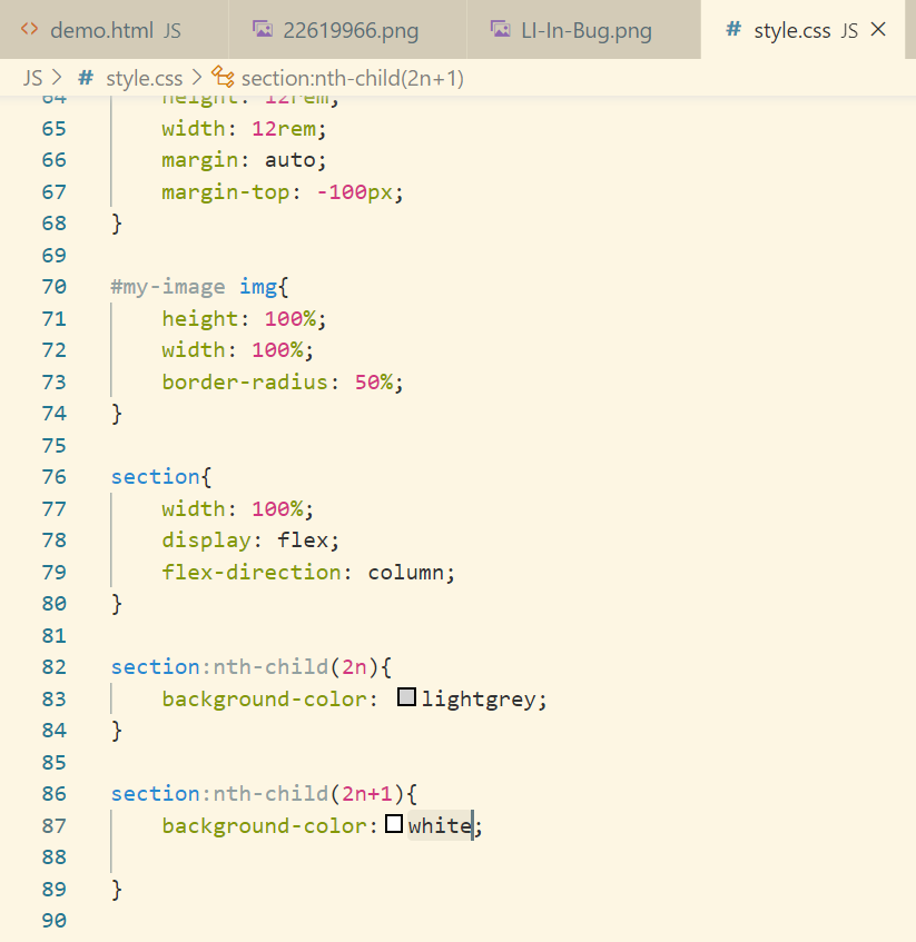
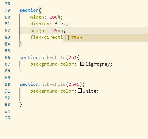
So as to see the sections with different color let’s set height as 75vh and later we can change that.
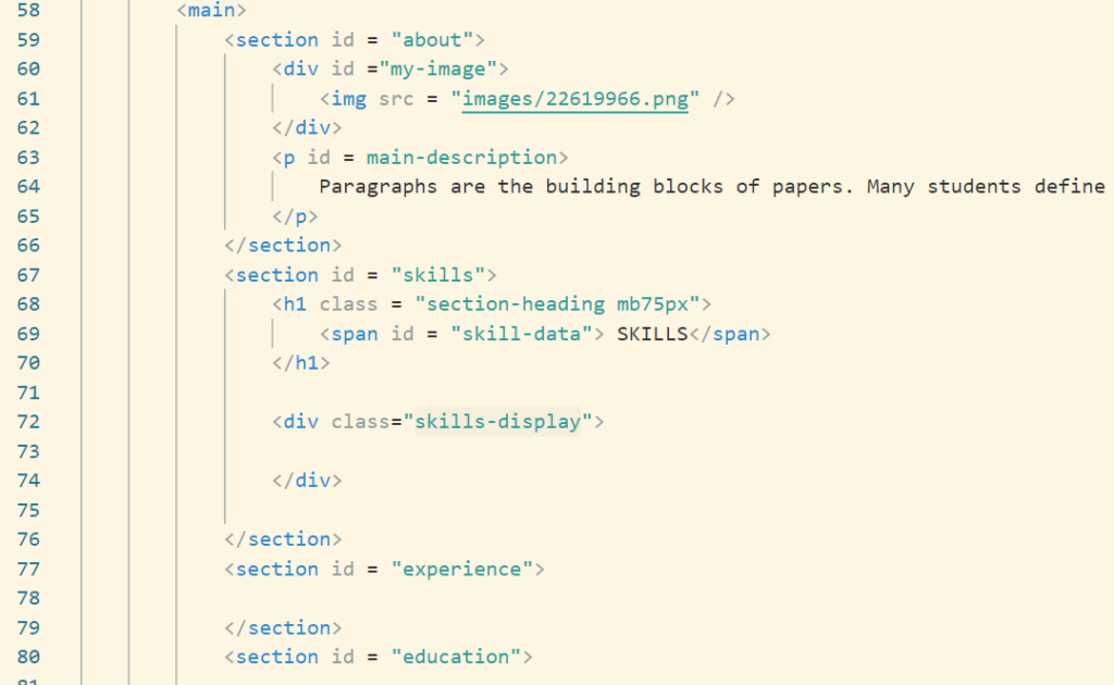
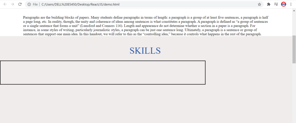
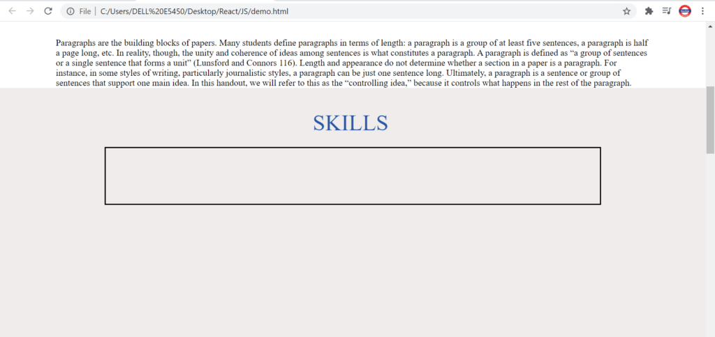
Skills Section
Let’s create html for this first.
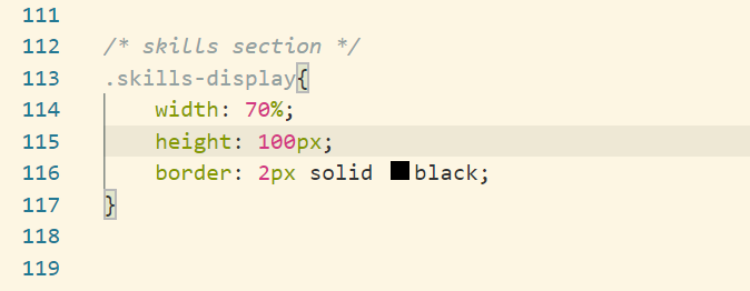
Let’s jump onto the css part of the above code
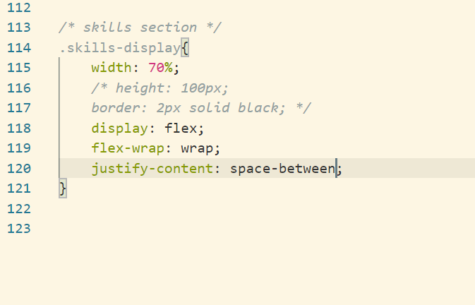
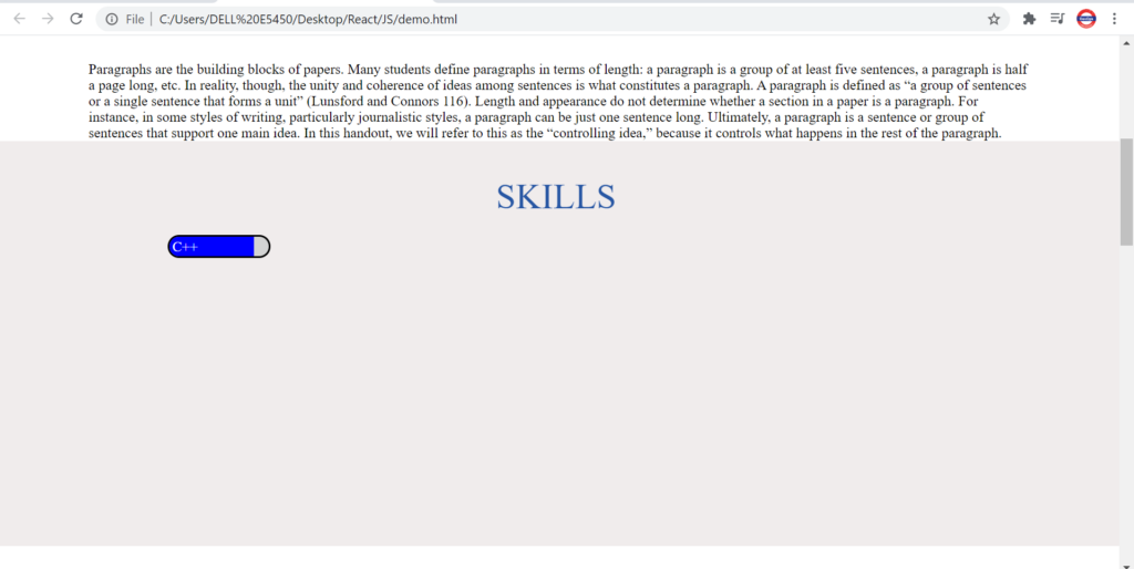
Now let’s display the skills in form of a bar %. Let’s create a HTML for the same.
Let’s align the div in center.
Let’s modify our skills display section as per our need.
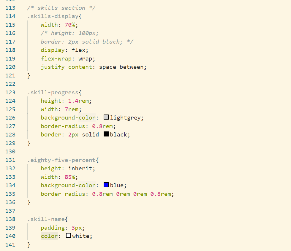
Let’s create the skills tab now
In this we will have a parent div with color grey and a child div with some other color which will indicate the percent of that particular skill.
Here is the HTML code for one skill
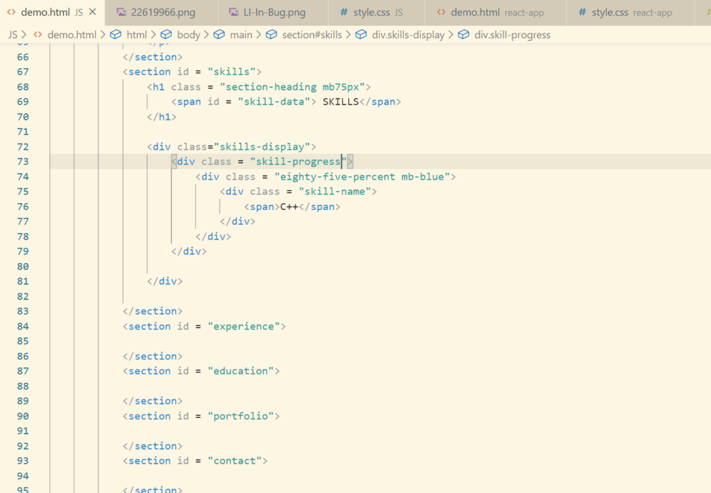
Now let’s write relevant CSS code for this skill
Similarly we will add the remaining of the skills.
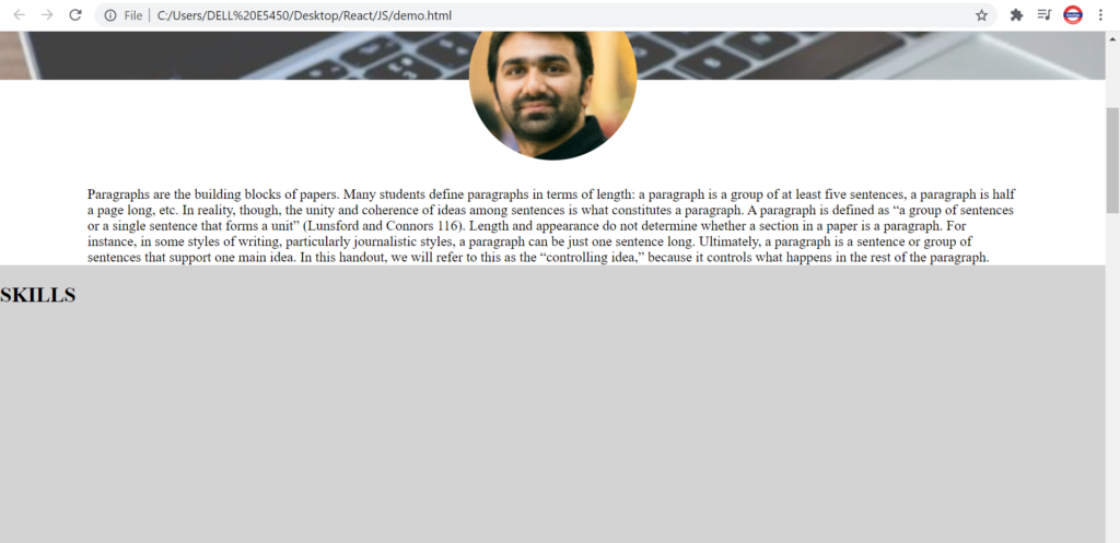