Adding Color
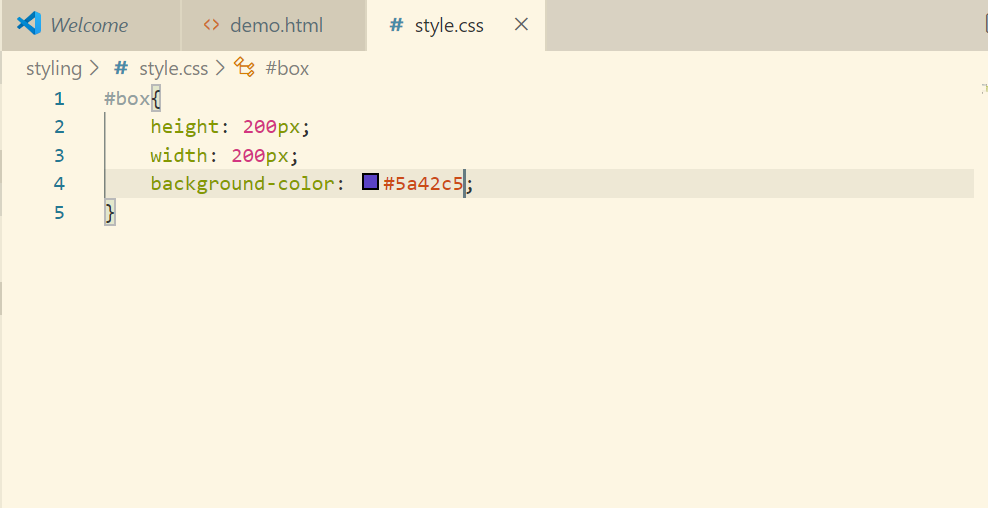
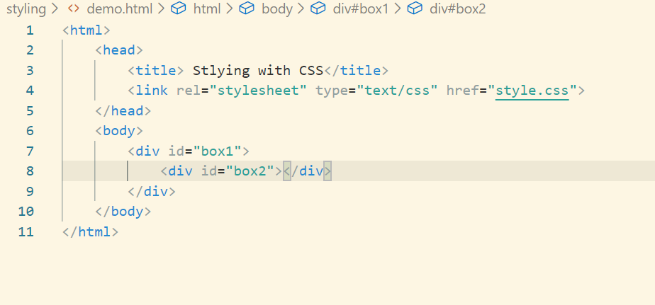
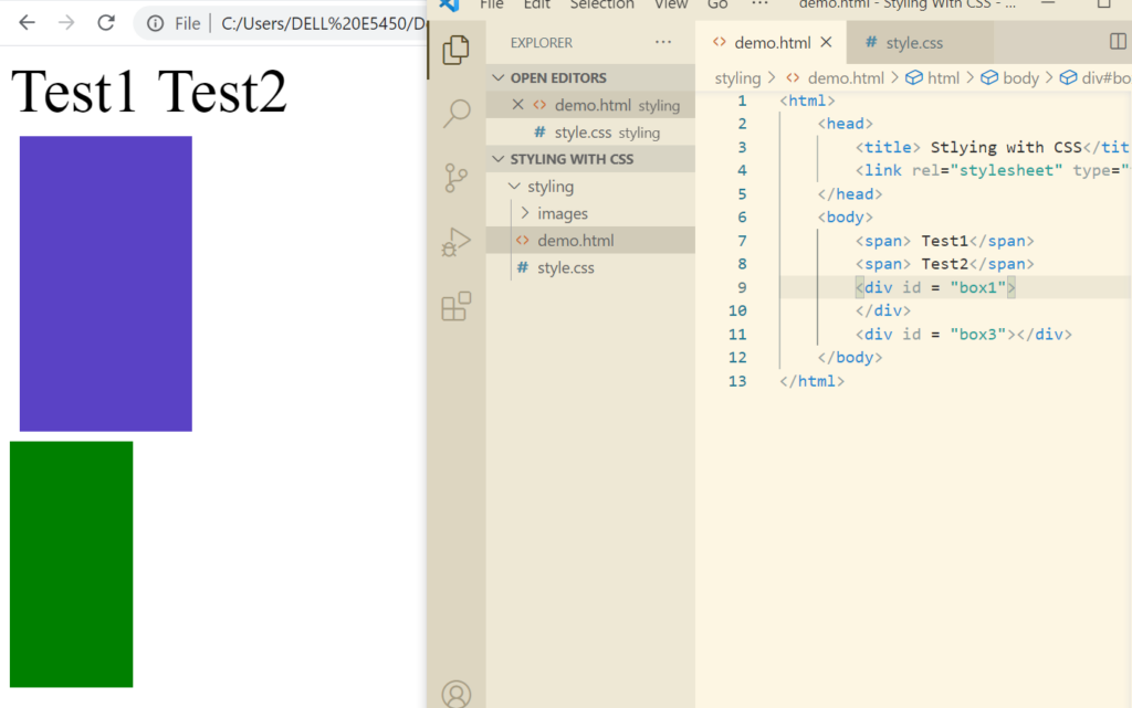
Let’s create a div with some id
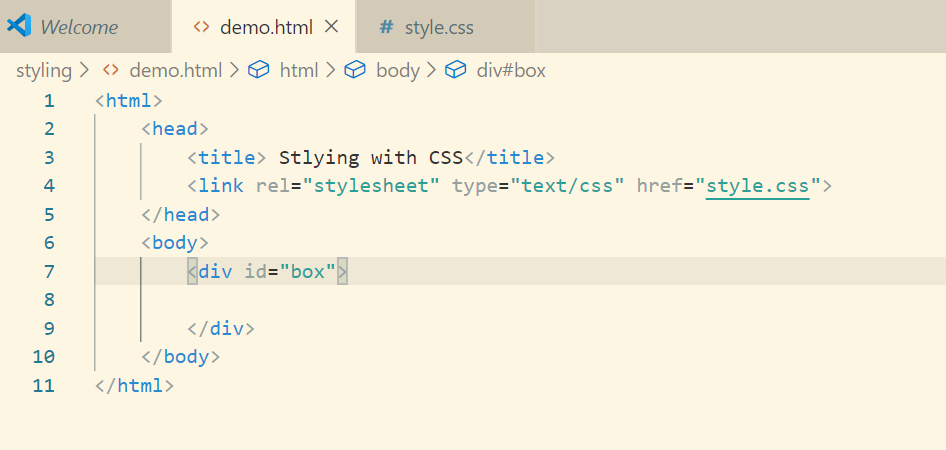
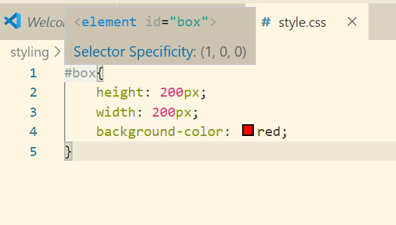
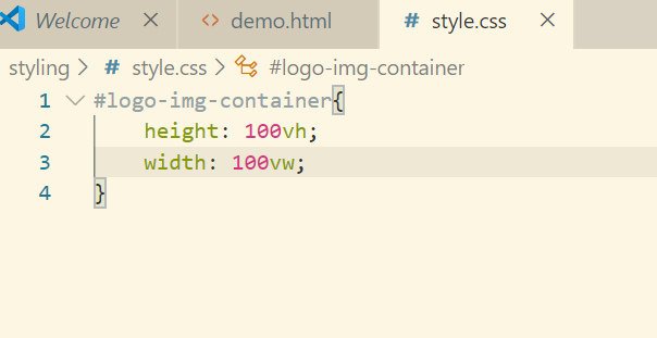
Now let’s add style to this div in style.css
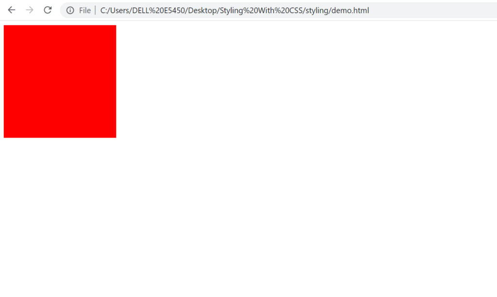
This is how our html will look like:
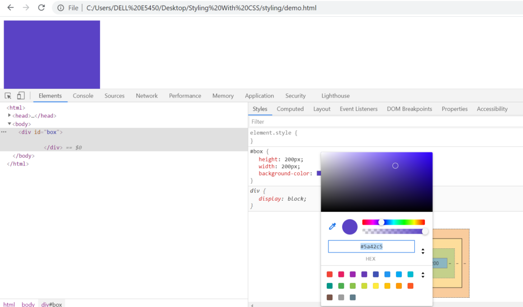
Let’s set the color using hexadecimal now.
CSS Units
One of the most prominent unit that we are using is px(pixel).
We can categorize the units into 2 parts:
- absolute(cm,in,px) where 1px = 1/96 of inch(in)
- relative
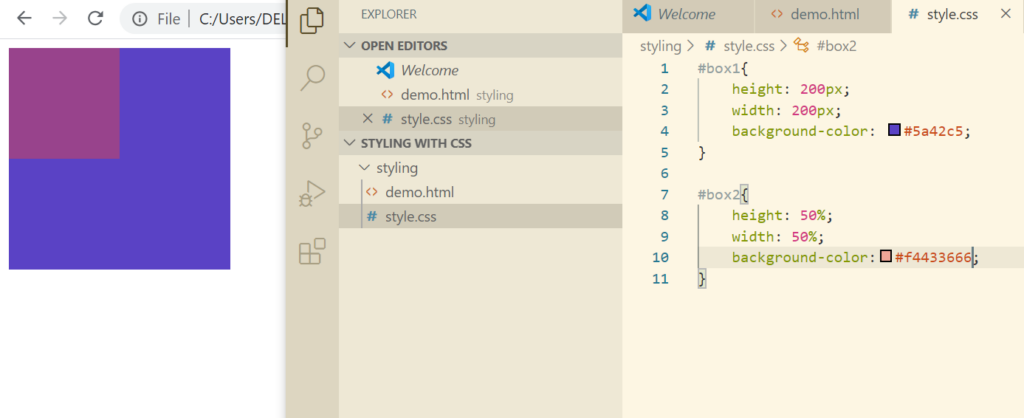
In order to understand relative CSS unit let’s do it practically.
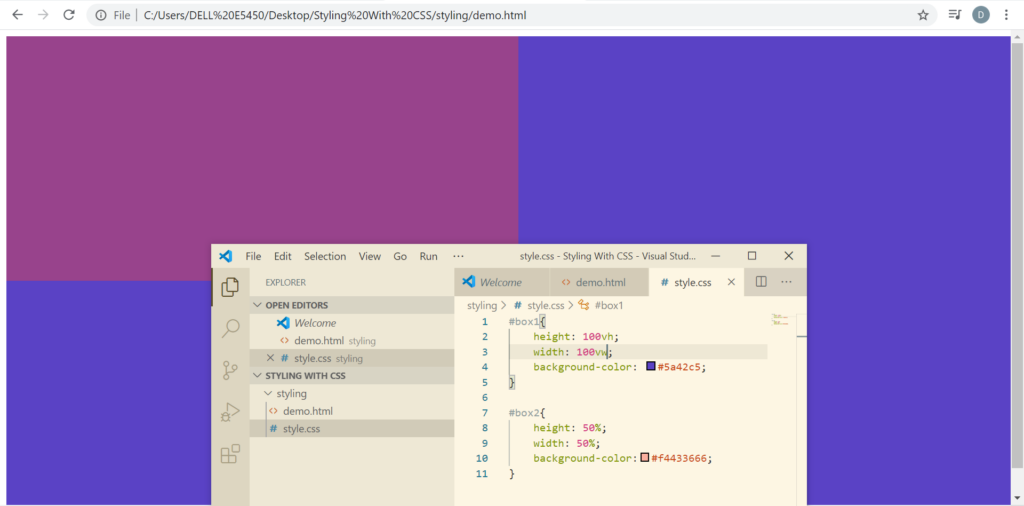
The other way by which we can set the relative CSS unit is viewport height(vh) and viewport width(vw). vh and vw cover the whole of the browser horizontally and vertically.
The last way to declare the CSS unit is using rem.
1 rem = font size of the root i.e the html
In most of the cases it is 16px or 20px. However, you can set the font size of the html explicitly and define the div ass per rem.
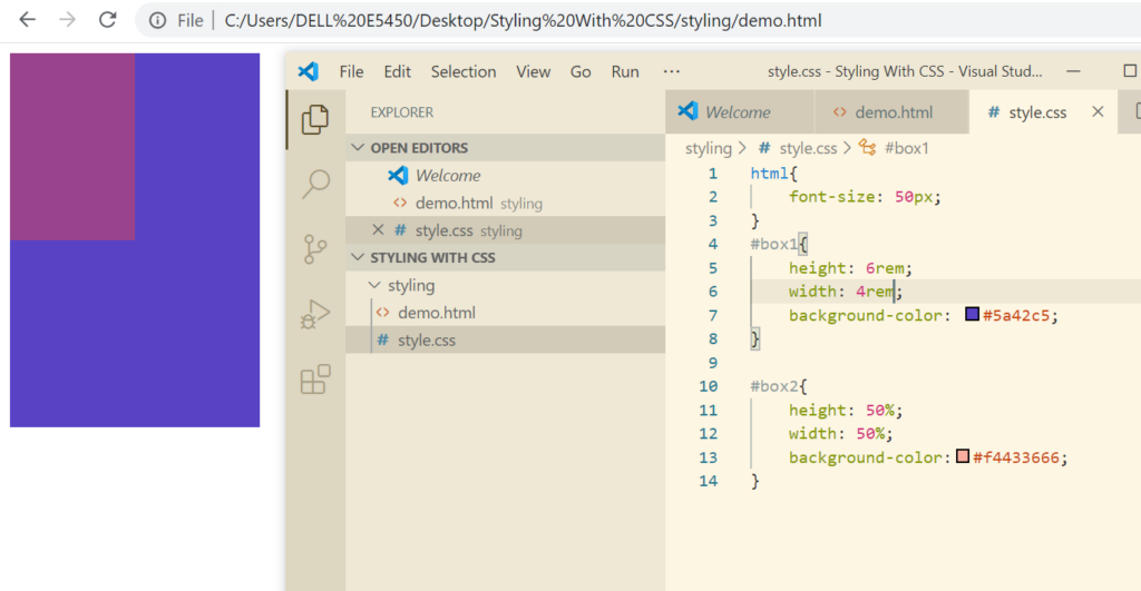
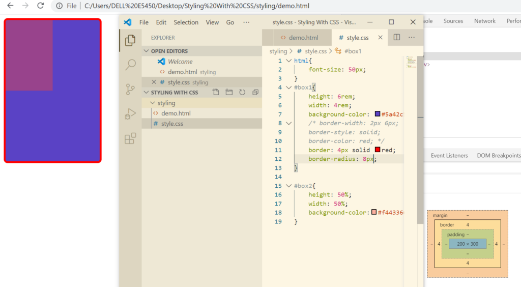
Adding Border to An Element
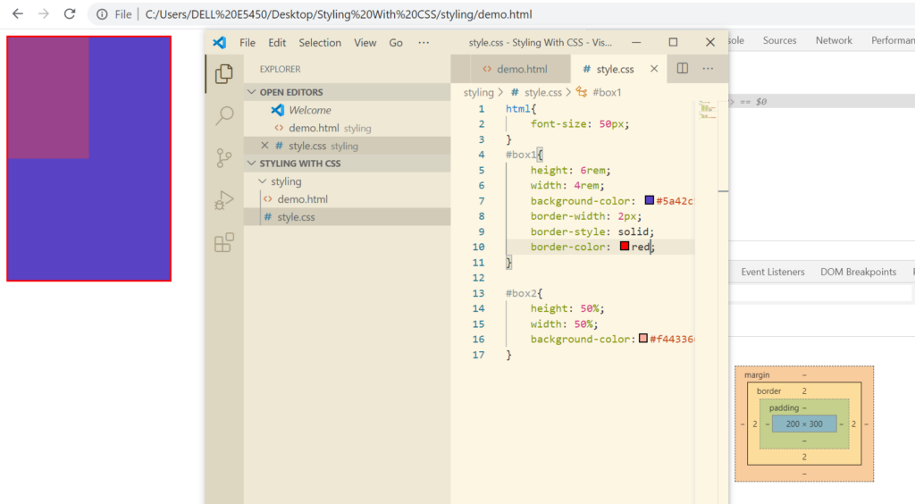
Types of border styles: dashed, dotted, double
What if I want top and bottom border of 2px and left and right border as 6px
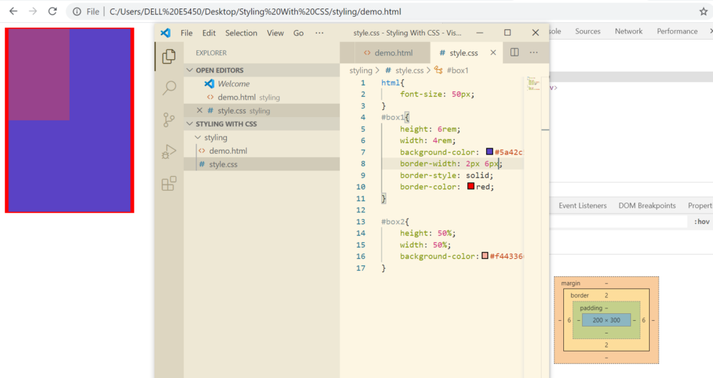
If you want all the borders defined separately, we can do that by defining all separately as 2px 4px 6px 8px(top, right, bottom, left)
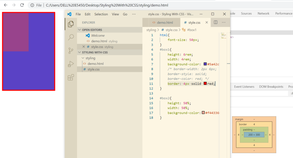
Rather than defining 3 different properties for borders explicitly, we can define that in a single line.
Border Radius – used to curve the border from the corners
Let’s say for a para you just need a left border. In that case we can use border-left property.
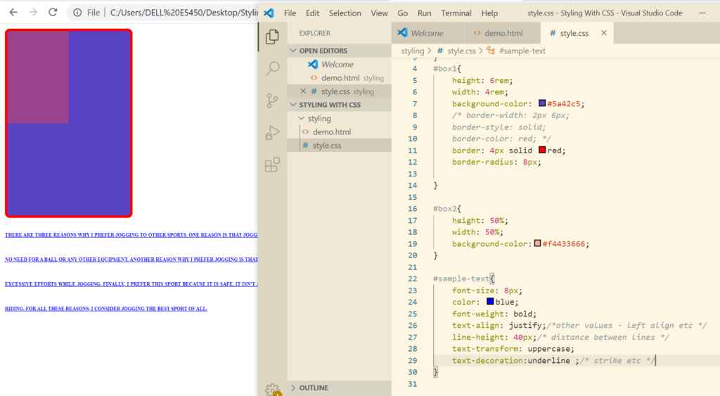
Text Styling
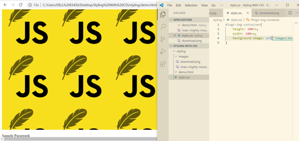
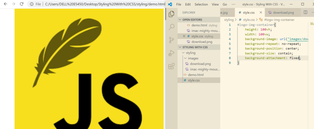
Adding Background Image to an Element
Adding background image
Eliminating the repeat now
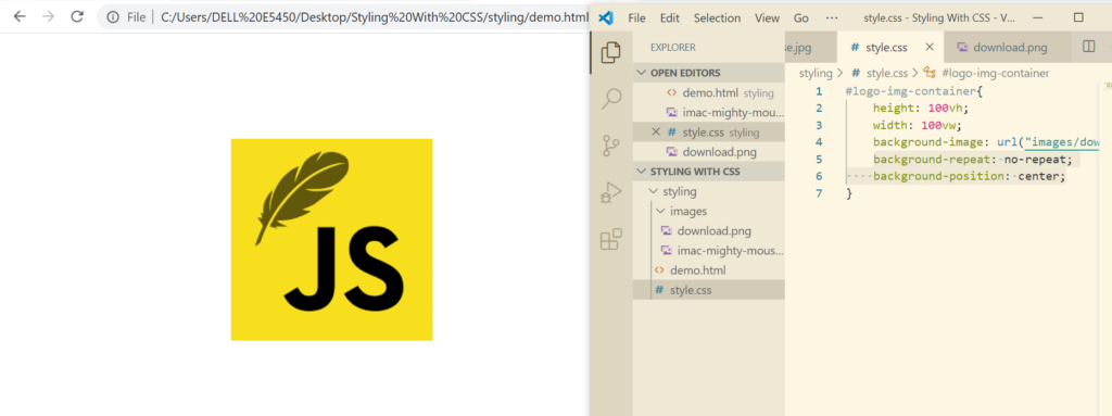
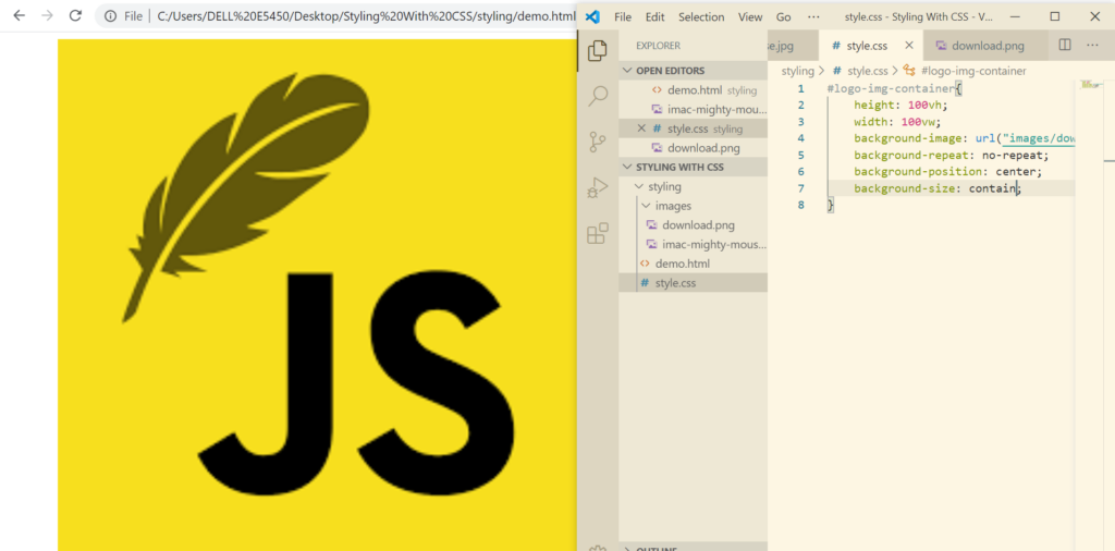
background-size
So as to let the image scroll or let the image remain fixed(where just the scroll bar moves). We need to set the background-attachment property
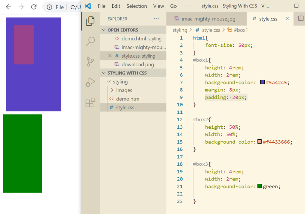
Margins And Padding
Margin is the space around the element.
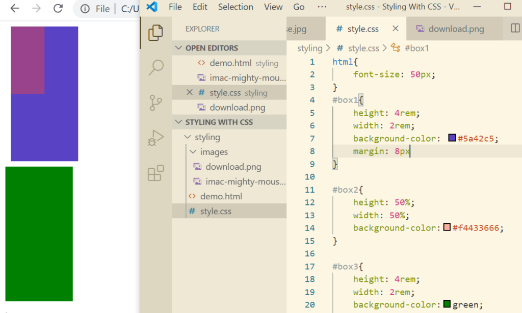
There are properties like margin-bottom etc just like borders.
Vertical(top bottom) margin between 2 elements collapse, they do not add up. However, horizontal margins add up.
Margin: auto will place the element in center of the div horizontally
Padding
Padding decides the space within an element.
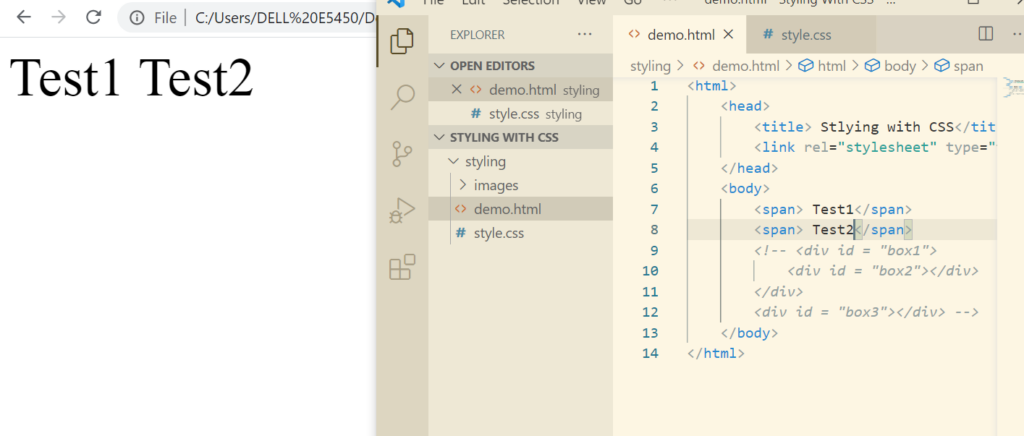
Display Property
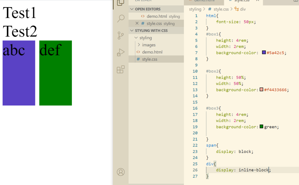
We have already read about inline and block property. Let’s have a look at both of them again. As we know span has an inline property.
Now let’s check the block elements which is div.
We can also explicitly define the display property.
Now let’s change block to inline.
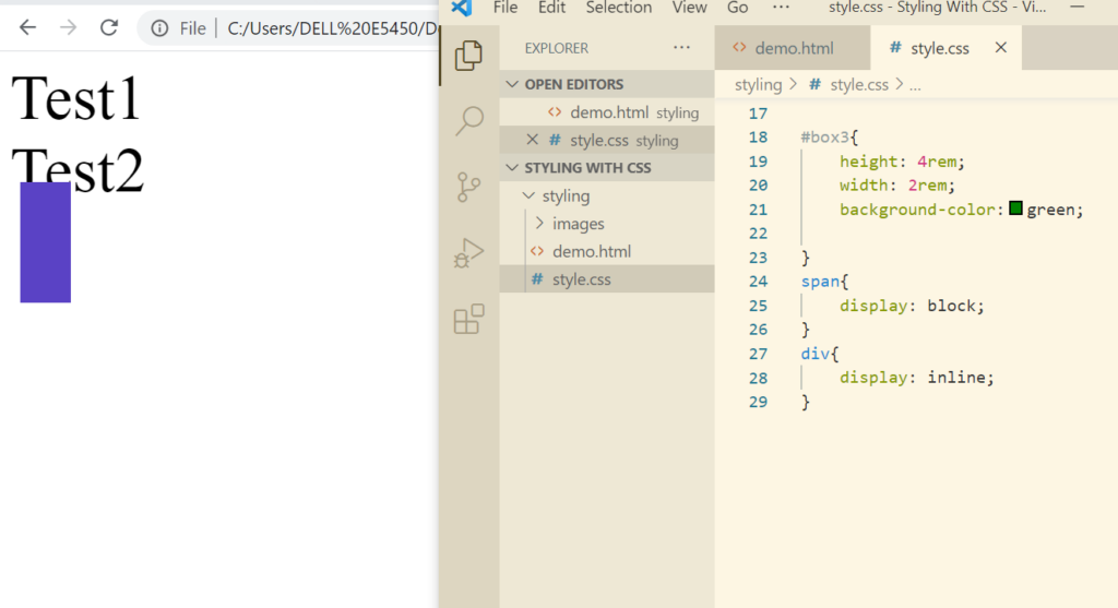
Here we see that the div has not been set to inline. That is because you cannot set height and width of an inline element as inline elements are expected to behave this way. In fact you cannot give margins and padding as well.
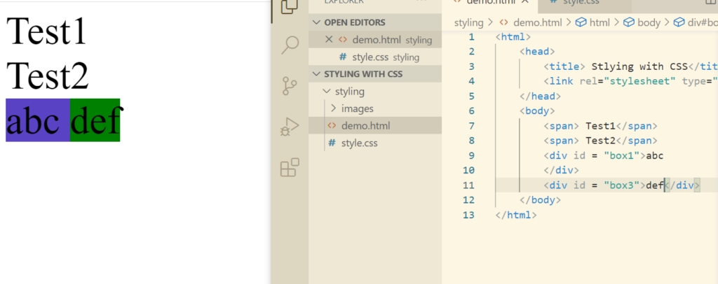
Now let’s try to solve this using some text.
If we want to exploit the properties of block like padding, margins etc, we can do that using inline-block.
If an element becomes invisible but the rest of the web page layout is not affected, then visibilty:hidden property is applied to that element.
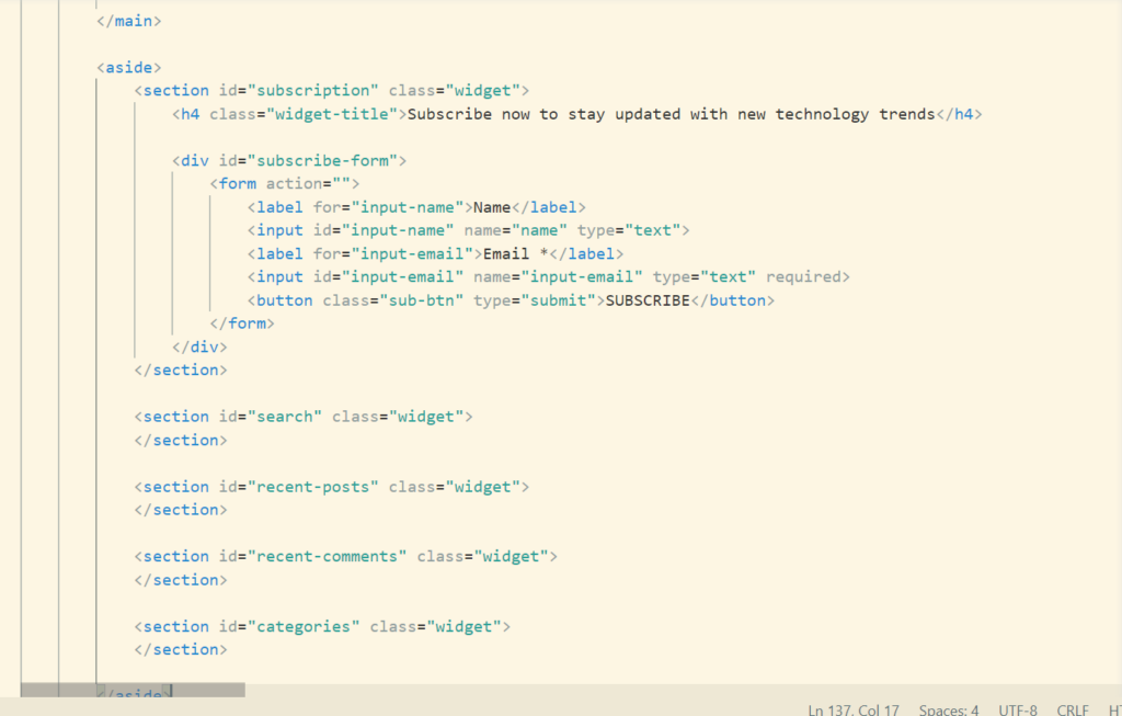
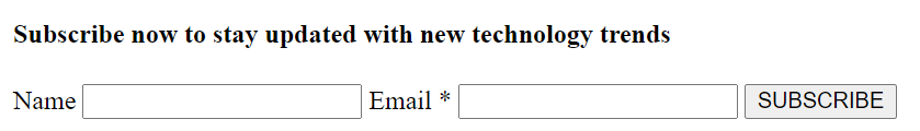
Aside Section
So as to jump into the css aspect of the aside section, let’s create a html for this.
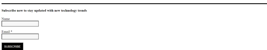
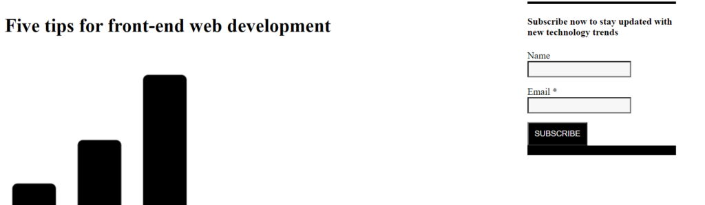
This is how blog looks like currently
We will keep this in inline-block and set the width as well because we want to adjust the aside section as well.
This is how our html code looks like. Now its time to shift the aside section along with the starting of the blog using css.
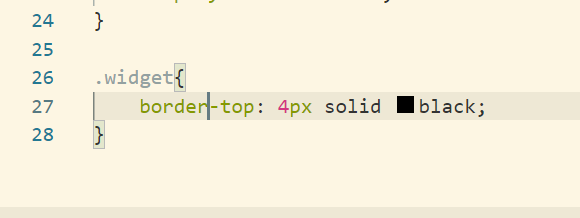
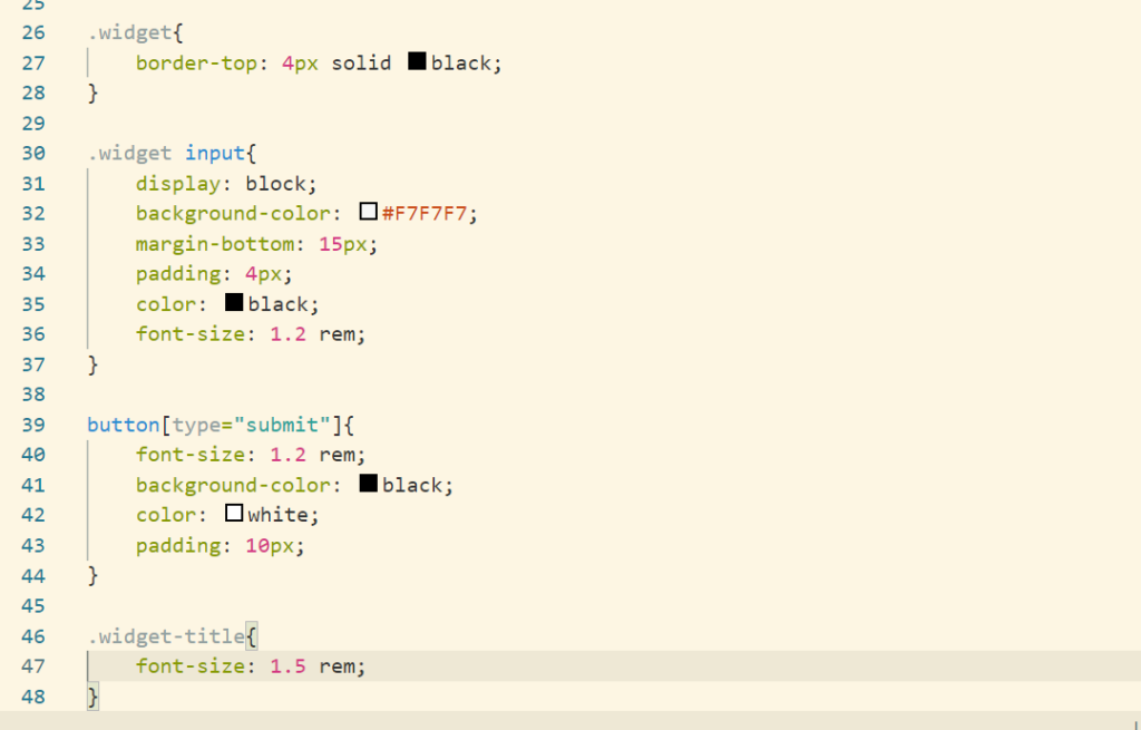
Firstly adding the border to the top of aside section.

Now setting up the aside section by adding css
Its time to place the aside section on right side of the main section
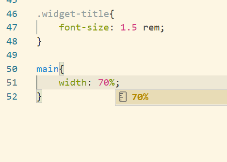
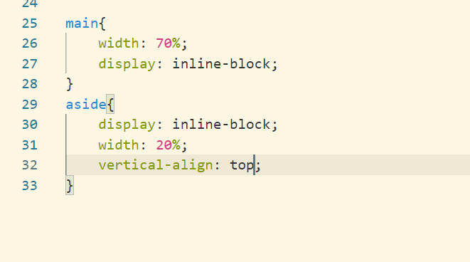
Currently the main section is occupying whole of the width of the browser. Firstly we should reduce the width of the main section.
Next step is to set the main and aside section to inline block
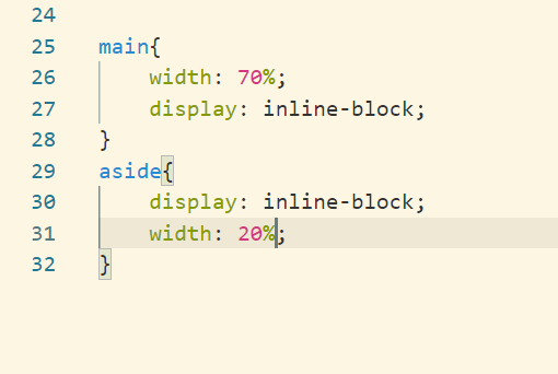
As of now aside section is bottom aligned.
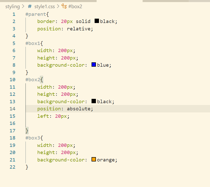
Position Property
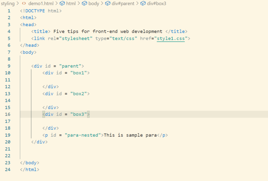
Let’s create a div and 3 div and 1 para inside it.
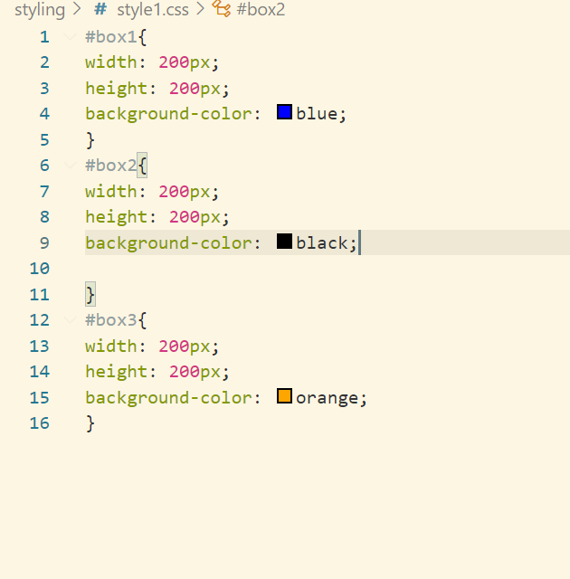
There are 5 different type of position property
- static – This is what we are covering till now. static means that the element will placed at the position where it is supposed to be
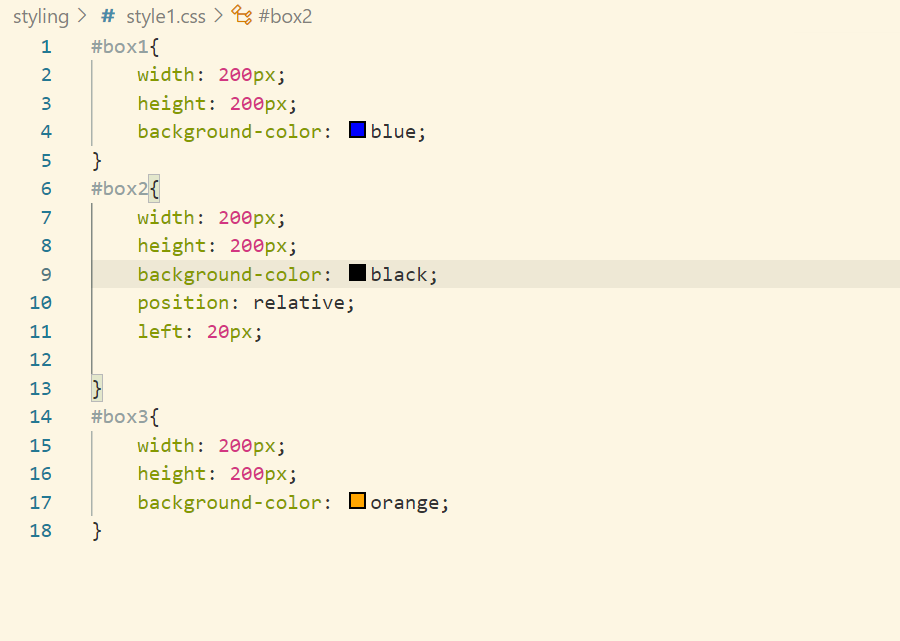
- relative – we can give relative as left, top etc. Let’s say we have given left:20px, then the element will shift towards 20px from its original position

- absolute – absolute is positioned wrt the first relative positioned parent. Parent for 2nd div is the outer div
- fixed – this element will stick to the viewport i.e when we scroll the element position does not change
- sticky – its a combination of relative and fixed
Box Model
We can consider every html element as a rectangular box.
So the 200px*200px is the width and height of the content. So as to get the actual height of the element we need to add border and padding as well. This is know as the content-box with a default property as box-sizing.
If we want that our elements size should be the actual as defined in css, then we need to change the box-sizing to border-box which is know as Box Model.
Min Max Width
If we want that our element should not increase/decrease on resizing the browser upto a certain limit, then we need to set min-width:150px. Now the element(div in previous case) will not go below 150px.
Similarly we can use max-width, min-height, max-height property.
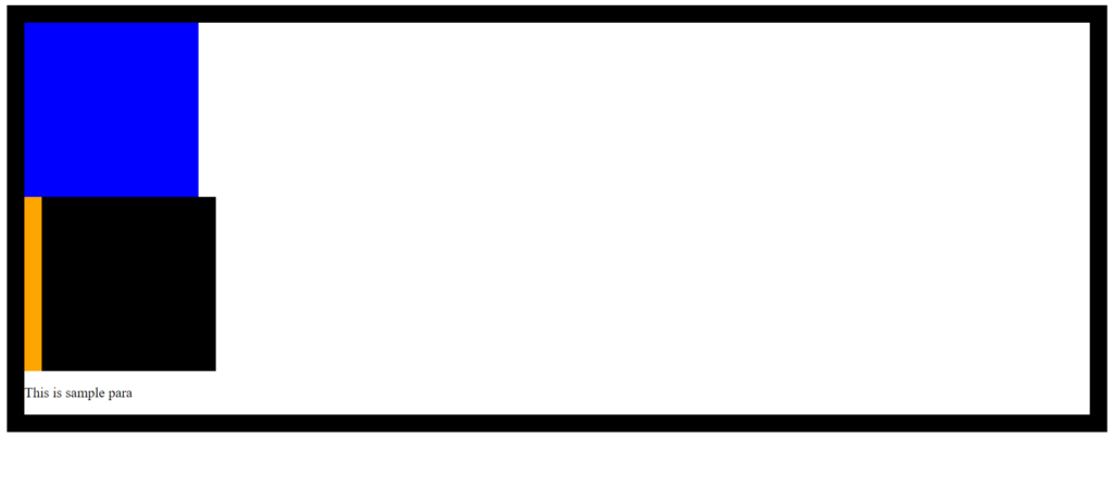
In case there is overflow of data from an element(let’s say div). There we can set the overflow property to scroll/visible/hidden/auto