Responsive web design is an approach to web design that makes web pages render well on a variety of devices and window or screen sizes.
How to make a website Responsive ?
There are 3 ways of doing that.
- Responsive Web Design
Here you write CSS rules to control the responsiveness.
- Dynamic Serving
In this HTML, CSS and JS files are returned from the server depending on the kind of device being used to make the request. The issue with this approach is that you have to maintain different files. Secondly, if the server is unable to decide which device has made a request then some wrong HTML, CSS , JS files would be shared.
- Seperate Mobile website
There is a separate website for mobile which usually starts from m. (m dot)
Measurement Units for Responsive Design
Step 1: Using right set of measurement units is the foremost step to start with the responsive design.
There two major categories of measurement:
- absolute – px, in, cm
- relative – %, vh, vw, rem, em
Let’s revisit these unit so as to understand where we can use all of the above.
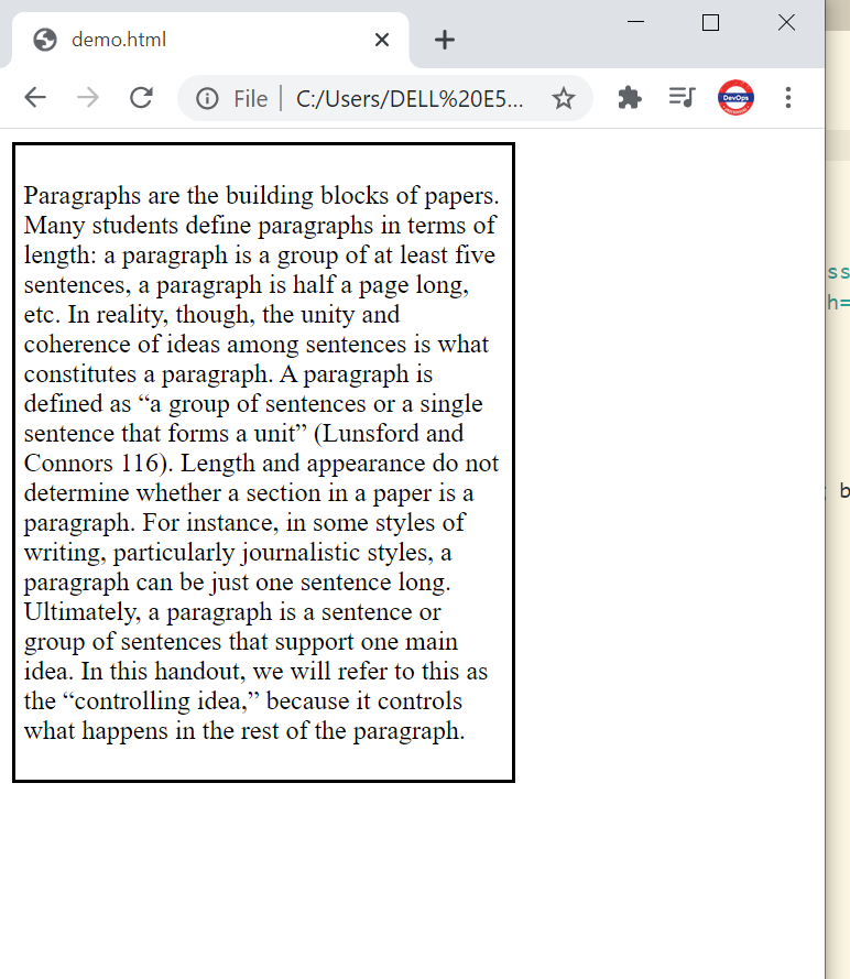
Let’s take this up with help of an example:
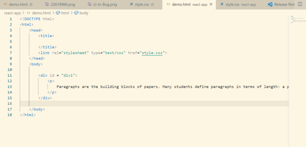
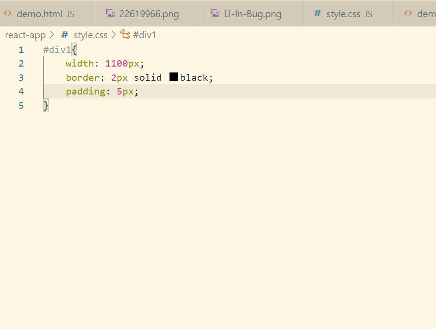
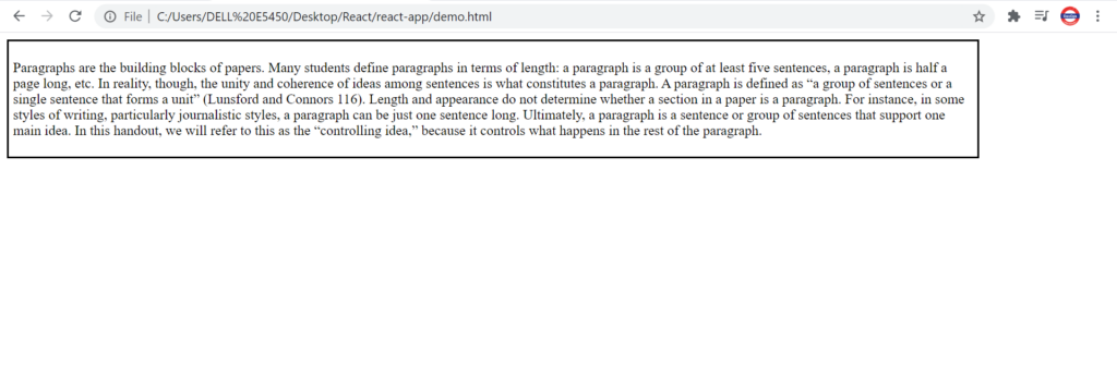
If we decrease the width of the browser. The webpage is not responsive.
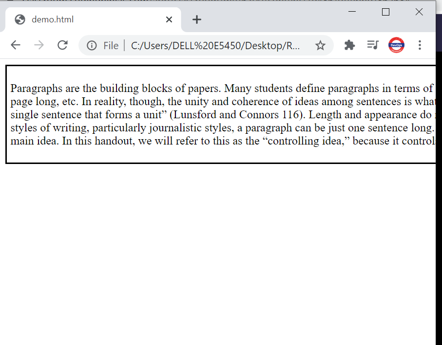
So as to solve this issue we will be making use of the Fluid Layouts i.e we will be using relative units.
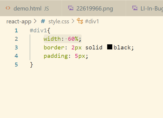
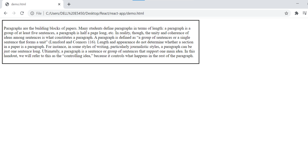
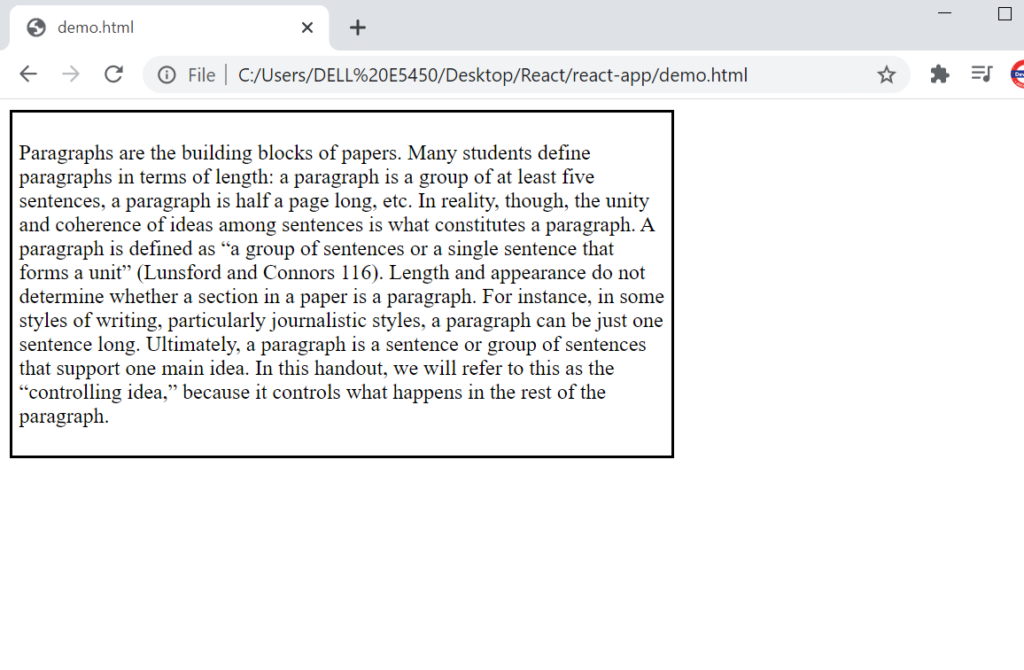
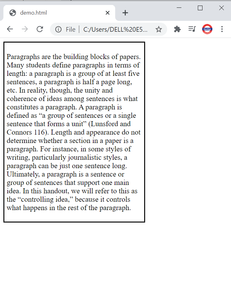
Using fluid comes with one challenge. If for a laptop 60% width looks good, then there is a possibility for a smaller or a bigger screen the same 60% won’t look that good.
In order to solve this and prevent the blur data/image or to prevent the image from pixelation we can give properties like min-width, max-width etc.
rem and em relative properties can be used with text-size. rem is w.r.t root font size and em is w.r.t element font size.
Viewport Meta Tag
Viewport is the visible area of the webpage
There is a option in browser which suggest you to open your screen on mobile etc.
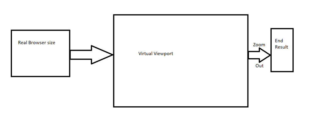
This is done by browser by creating a Virtual Viewport of max size and then zooming out to get the mentioned screen size. Example:
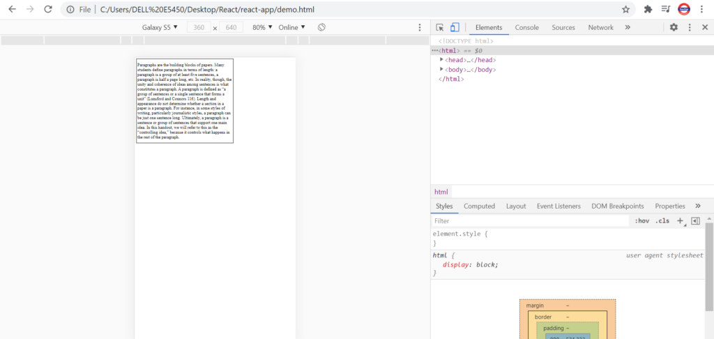
Here browser is trying to optimize the screen to that of Galaxy but browser is not that optimized to do so. Here we need to zoom in to read the content.
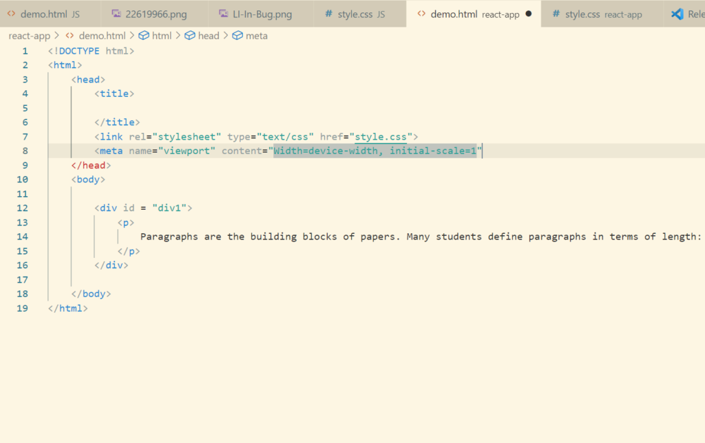
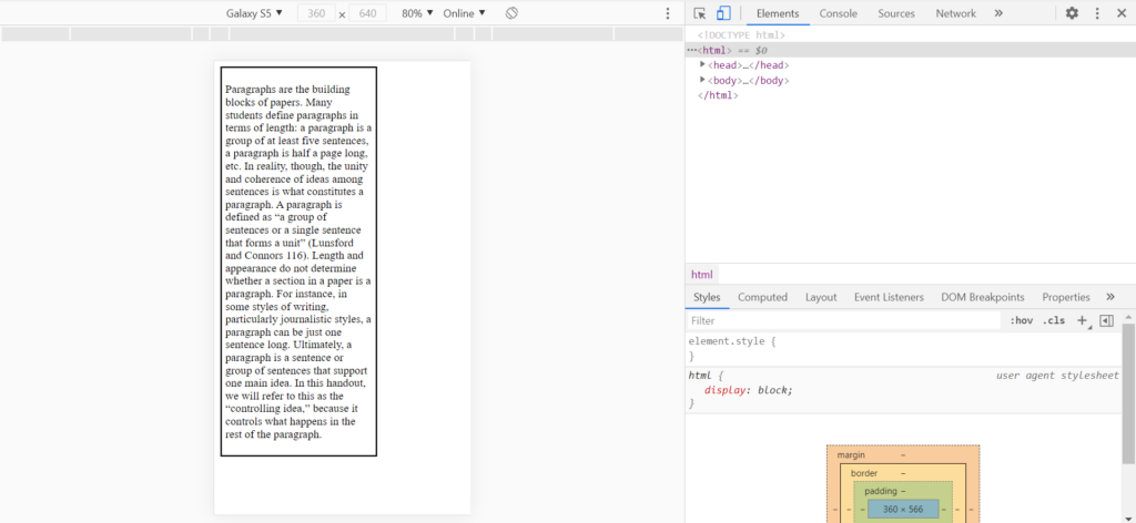
This issue is solved using Viewport Meta Tag and Media Queries.
Media Queries
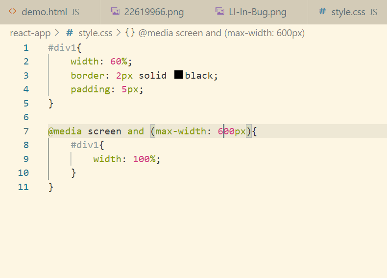
Media queries were introduced in CSS. They are really helpful to developers as they give flexibility to developers to which CSS rules should apply based on device type and device properties. For example if device width is let’s say <600px or >600px then we can define if width is <600 then x rules should apply and if width is >600 then y rules should apply.
Every media query have 2 components:
- Media Type – screen, print, speech, all
- Media Property – width, height, screen resolution
Let’s do it practically. Let’s decrease the screen width fully
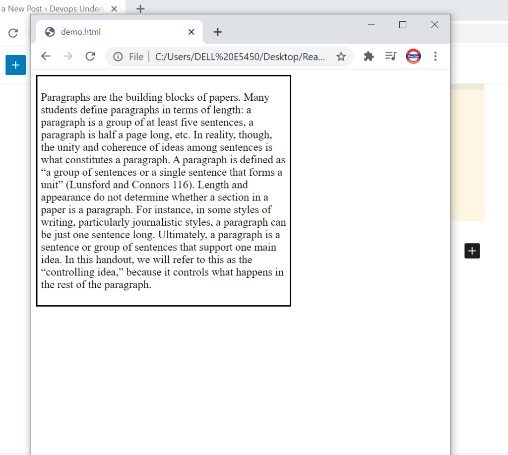
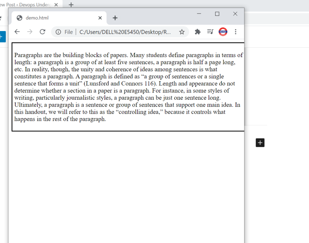
Now we want if screen width is less than 600px then content should be displayed on the full screen.
Desktop First Vs Mobile First
These are the two approaches using which we can achieve responsiveness.
- Desktop -> Tablet -> Mobile
- Mobile -> Tablet -> Desktop
Depending on the usage we can pick up any of the approach.